Visual clarity is key to making better presentation slides. Two slides can contain similar information, yet one is easy to understand while the other feels uncomfortable to look at. Why? Sometimes the difference is simply how the content is positioned, the spacing between elements or the size of an object. Relatively small visual adjustments can make a noticeable difference.
Let's examine five adjustments you can make to improve your slides.
Size affects visibility, but it also communicates importance. Text, images and graphic objects that are too small will be difficult to see. Important information can be made more prominent than supporting information, helping the audience understand what to notice first.
Tip: Bigger is usually better, but this does not mean that everything should be equally large. Use different sizes to create a clear visual hierarchy.


Spacing helps direct the eye to objects on the slide. It is difficult to distinguish information when a slide is crowded. Space is an active part of slide design, not simply an empty area that needs to be filled. Appropriate spacing can separate information, group related content and make important elements easier to notice.
Avoid placing important text or objects uncomfortably close to the edges of the slide. The same applies to text inside rectangles and other shapes: leave enough breathing room between the content and the edges of its container.
Tip: Give each element enough space to be seen and understood clearly.

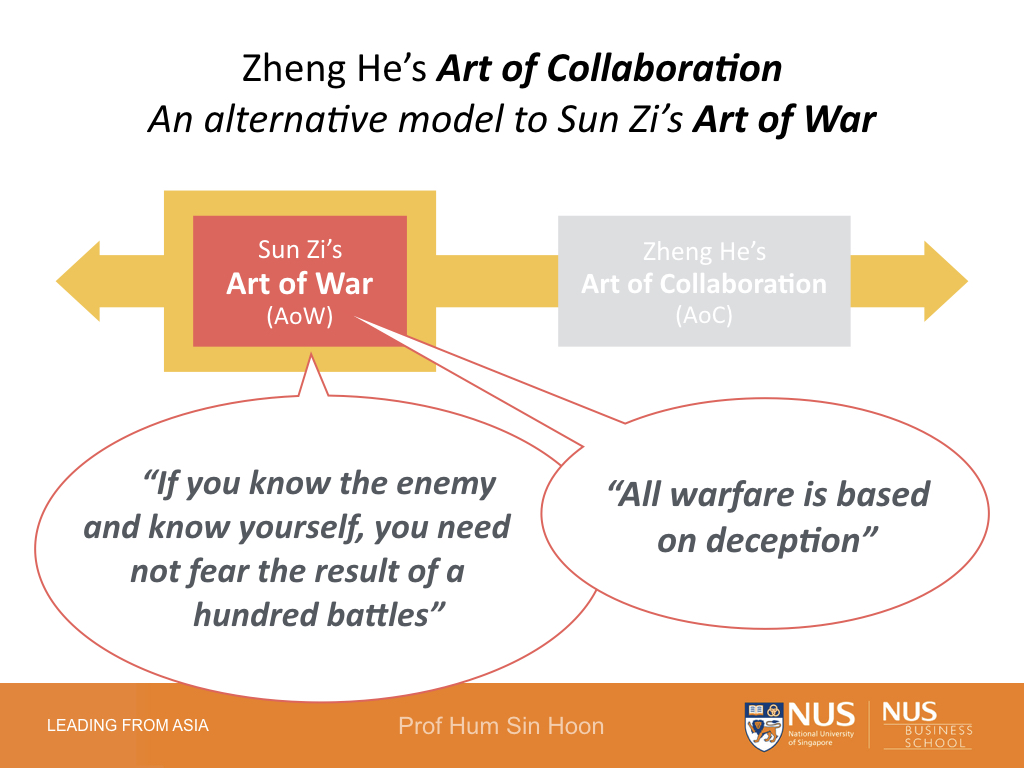
Colour & Contrast influence the mood of a slide and help organise its information. Sufficient contrast between the foreground and background makes text and other elements easy to distinguish. Colour can also create emphasis, group related information and establish hierarchy.
Bright or vivid colours can work well when used intentionally. The important consideration is whether the information remains clear and readable against its background.
Tip: Check that every important element is easy to distinguish from what sits behind it.


Focus is the point on the slide towards which the audience's eyes are drawn. It is usually a prominent object or a single key piece of information. Without a clear focus, the audience may not know where to start looking. A clear visual hierarchy helps the audience know what to look at first, then where to look next.
Focus can be created through a combination of size, position, contrast, colour and surrounding space.
Tip: One simple way to create focus is to make the most important object more prominent than the supporting elements.


Alignment creates visual relationships between objects and gives a slide a neater, more intentional appearance. When elements do not align, the slide can feel messy or randomly assembled. Even layouts that appear informal usually have an underlying structure. Objects may align along edges, centres or invisible guides that create order.
Tip: Depending on the layout, align objects by their sides, tops, bottoms or centres using the alignment tools in your presentation software.
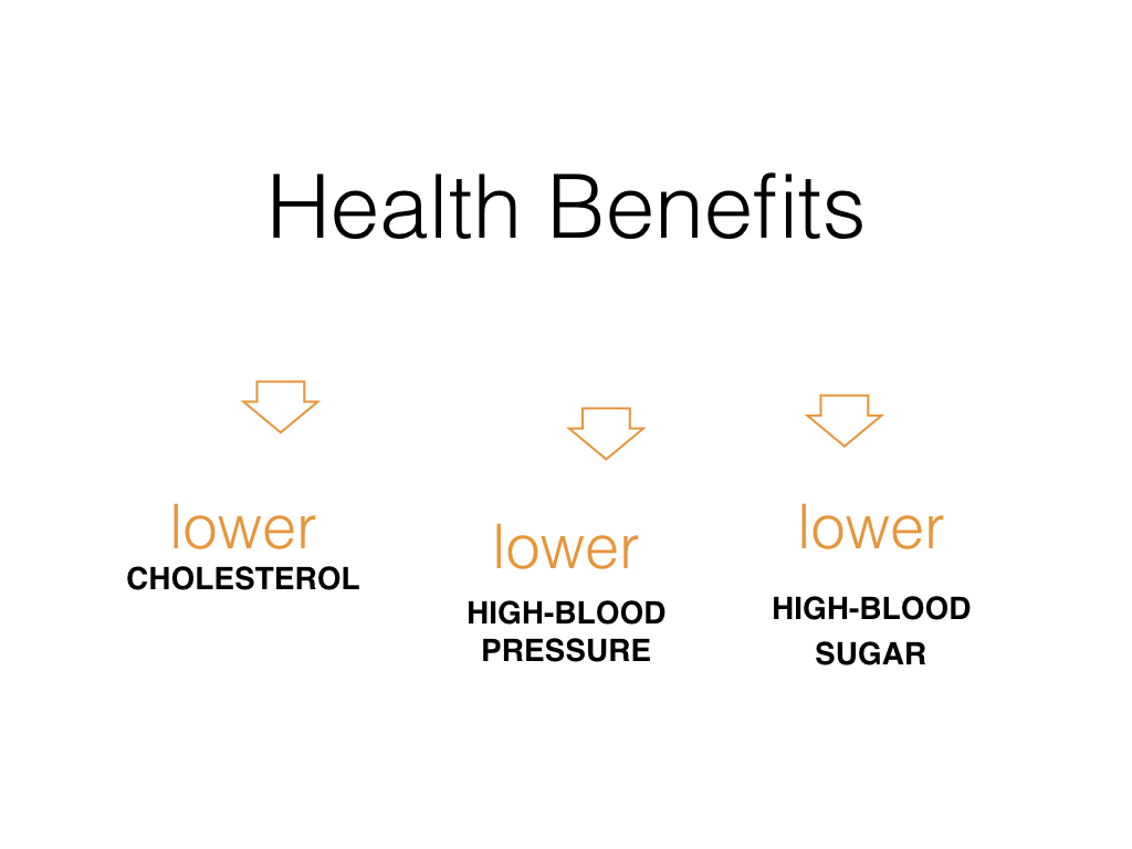
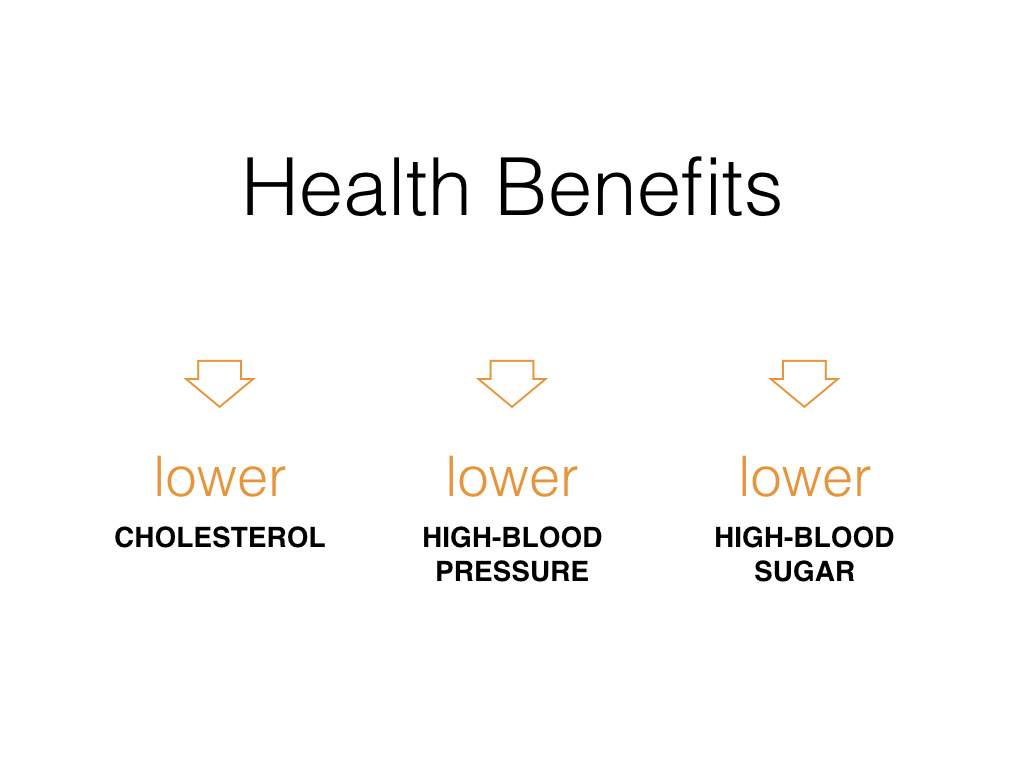
A well-designed slide will normally use several of these five visual adjustments together. Compare the BEFORE and AFTER examples above and you will notice that each improved slide applies more than one principle.
Before you finish your next presentation, use these five questions as a practical check:
- Size — Can everything important be seen clearly?
- Spacing — Does the content have enough breathing room?
- Contrast — Is everything easy to distinguish from its background?
- Focus — Is it obvious what the audience should notice first?
- Alignment — Do the elements feel organised and connected?
Small adjustments to size, spacing, contrast, focus or alignment can make a big difference. Applied together, they can make your slides neater, clearer, easier to see and more professional.


