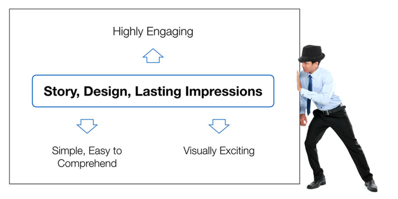
A good presentation slide is more than information arranged neatly on a page. There should be an idea behind the design.
Before deciding where to place the text, which shapes to use or what colours will look good, ask:
What do I want my audience to understand from this slide?
Then look at the information you have and ask a second question:
How do these ideas relate to one another?
Together, the answers to those two questions can give you the structure for the slide.
Find the story behind the information
Information — what we started with
Imagine that you begin with four pieces of information:
- Customer expectations for faster and more convenient service continue to increase.
- Competitors are introducing new services and responding to customer needs more quickly.
- Customers are increasingly using digital channels to interact with companies.
- Our current customer service approach has not changed significantly in recent years.
At this point, we have information, but we do not yet have a slide design.
Thinking — what does this information mean?
Instead of treating all four statements as equal, look for the relationship between them. The first three observations can be shortened into:
- Higher customer expectations
- Faster-moving competitors
- Shift to digital channels
Together, they lead to one larger conclusion:
We need to rethink our customer experience.
This is the important thinking stage between collecting information and designing the slide.
Slide — make the relationship visible
Now the information has a structure that can be visualised. Instead of four separate statements competing for attention, the slide can show three supporting observations connected to one central message.
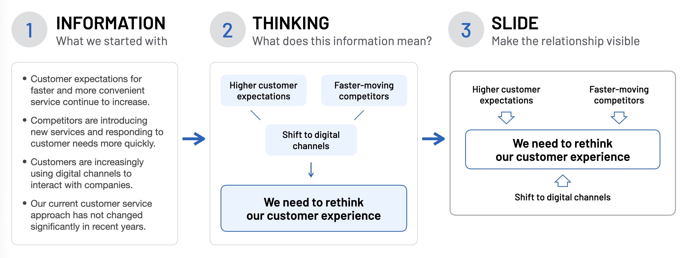
The result could be a slide like this:
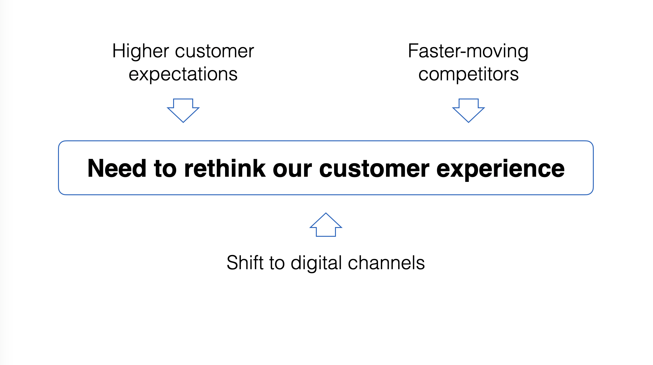
This is the story behind the slide. It doesn’t have to be a story in the traditional sense of a beginning, middle and end. It is the communication idea that connects the information and gives the slide its structure.
Identify the key message
Once you understand the relationship, decide what deserves the greatest attention. In the customer-experience example, the important message is:
We need to rethink our customer experience.
The other information helps the audience understand why, and that hierarchy should be visible in the design. The central message receives greater visual prominence while the other ideas support it.
The audience shouldn’t have to study every element before discovering what matters.
The visual hierarchy should reflect the message hierarchy.
This doesn’t mean the key message must always appear in the centre of the slide. The centre works well for this particular relationship, but another message may require a completely different arrangement. The layout should follow the communication relationship, not the other way around.
Find the relationships
Before arranging information on the slide, think about what the different ideas are doing.
Are they:
- reasons supporting a conclusion?
- causes producing an effect?
- steps leading towards an outcome?
- components forming a whole?
- alternatives surrounding a decision?
- outcomes resulting from one action?
Different relationships suggest different visual structures. Three reasons supporting a conclusion might surround one central message. A sequence of actions might be arranged from left to right. Several outcomes resulting from one strategy might radiate outward from a common starting point.
The objective isn’t to find an interesting arrangement. It is to make the relationship easier for the audience to see.
How many supporting messages?
Three supporting messages can create a simple, balanced relationship around one key message.
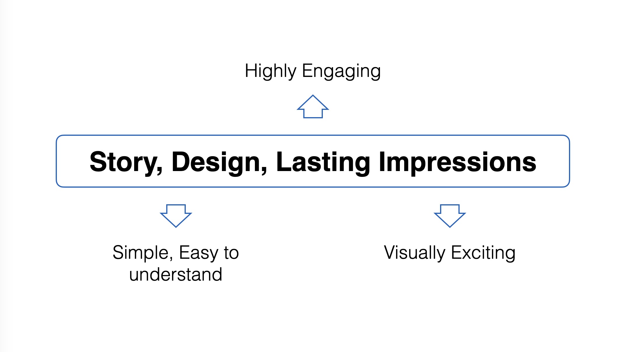
A fourth message can still be accommodated without making the relationship difficult to understand.
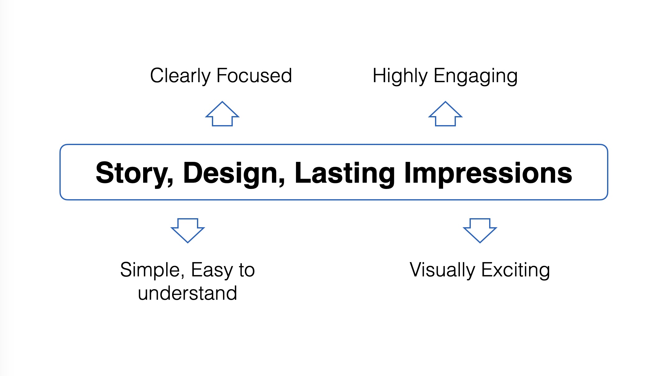
And sometimes five supporting messages may still work.
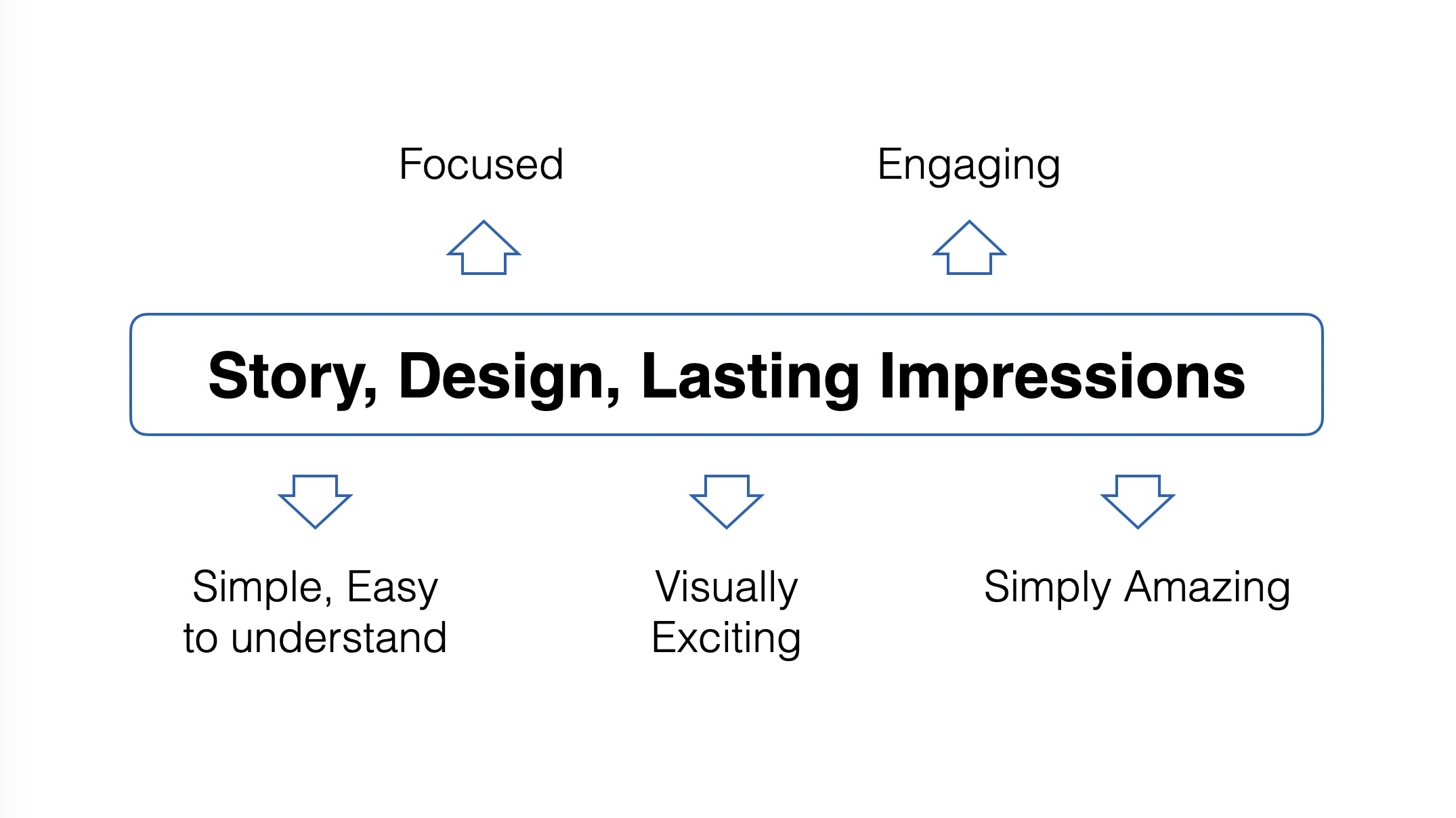
But notice what happens as more information is added. Each supporting message has less space and there are more elements competing around the key message.
Instead of deciding that every slide should contain three, four or five points, ask:
Can the audience still see the key message and understand how the supporting ideas relate to it?
The point is not that three, four or five is a rule. Clarity of the relationship is the test. If the relationship is no longer clear, you may need to simplify the information, group related ideas or continue the explanation on another slide.
Keep the supporting messages short
One of the difficulties in creating this type of slide is our tendency to put too many words into each supporting message. Long sentences turn the slide back into something the audience has to read.
Before designing each message, ask:
What is the shortest accurate way of expressing this idea?
For example:
Customer expectations for faster and more convenient service are continuing to increase.
This might become: Higher customer expectations
The shortened version gives you more freedom to work visually and makes it easier for the audience to scan the slide while listening to you.
But don’t shorten a message simply to make the slide look cleaner. The meaning still has to be accurate: simplify the wording, not the idea.
Make lines and arrows mean something
Connecting lines can help the audience understand how the supporting messages relate to the key message, but a line or arrow should have a reason for being there.
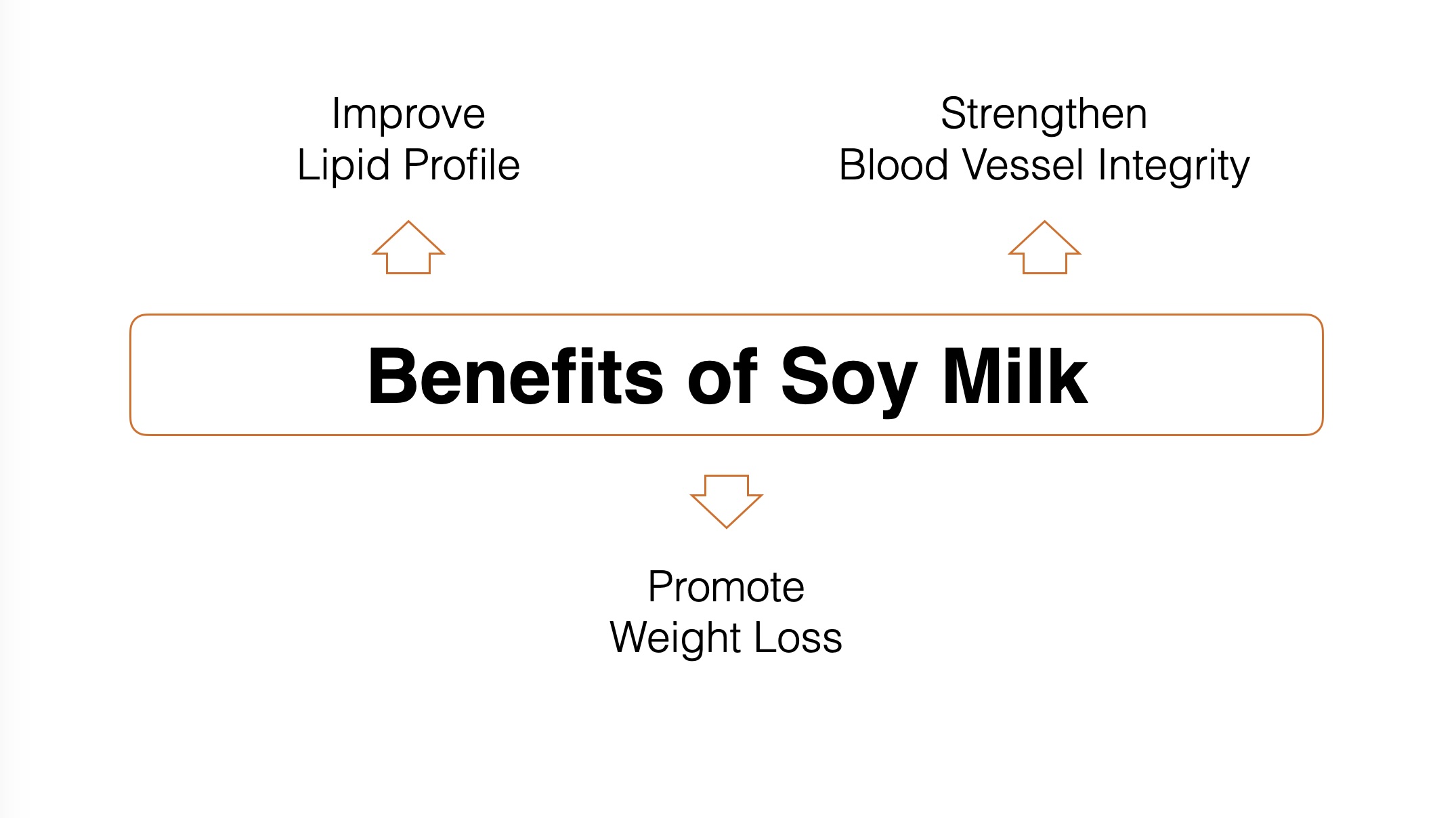
The direction of an arrow can also communicate the relationship between ideas. In the first example, Benefits of Soy Milk is the starting point and the supporting messages describe outcomes. The arrows therefore point away from the central message.
Now compare that with the next example. Several exercises contribute towards the outcome Increased Muscle Mass. The arrows therefore point towards the central message.
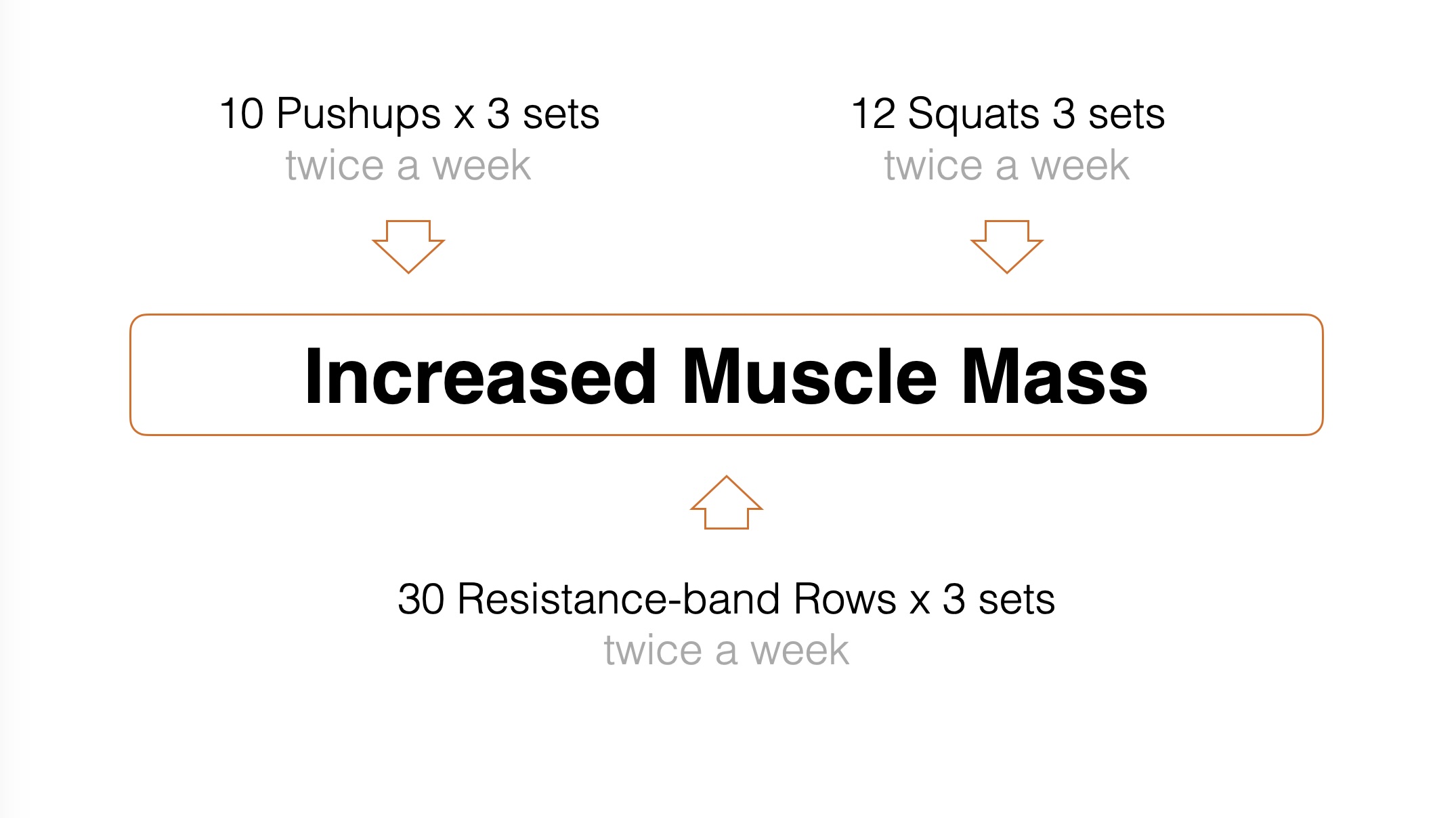
The visual structure is almost identical, but reversing the arrows changes what the diagram is saying:
- Outward arrows: one idea leads to several outcomes.
- Inward arrows: several contributing ideas lead towards one outcome.
The arrow isn’t simply decoration. Its direction helps communicate the relationship.
Before adding a line or arrow, ask:
What is this line telling the audience?
If the answer is nothing, it probably does not need to be there.
Let the supporting visual elements stay in the background
Not everything on the slide should have equal visual strength.
The key message and supporting ideas carry the information, while boxes, lines, arrows and other visual elements help organise the information and show relationships.
These supporting visual elements should usually remain in the background rather than compete with the message.
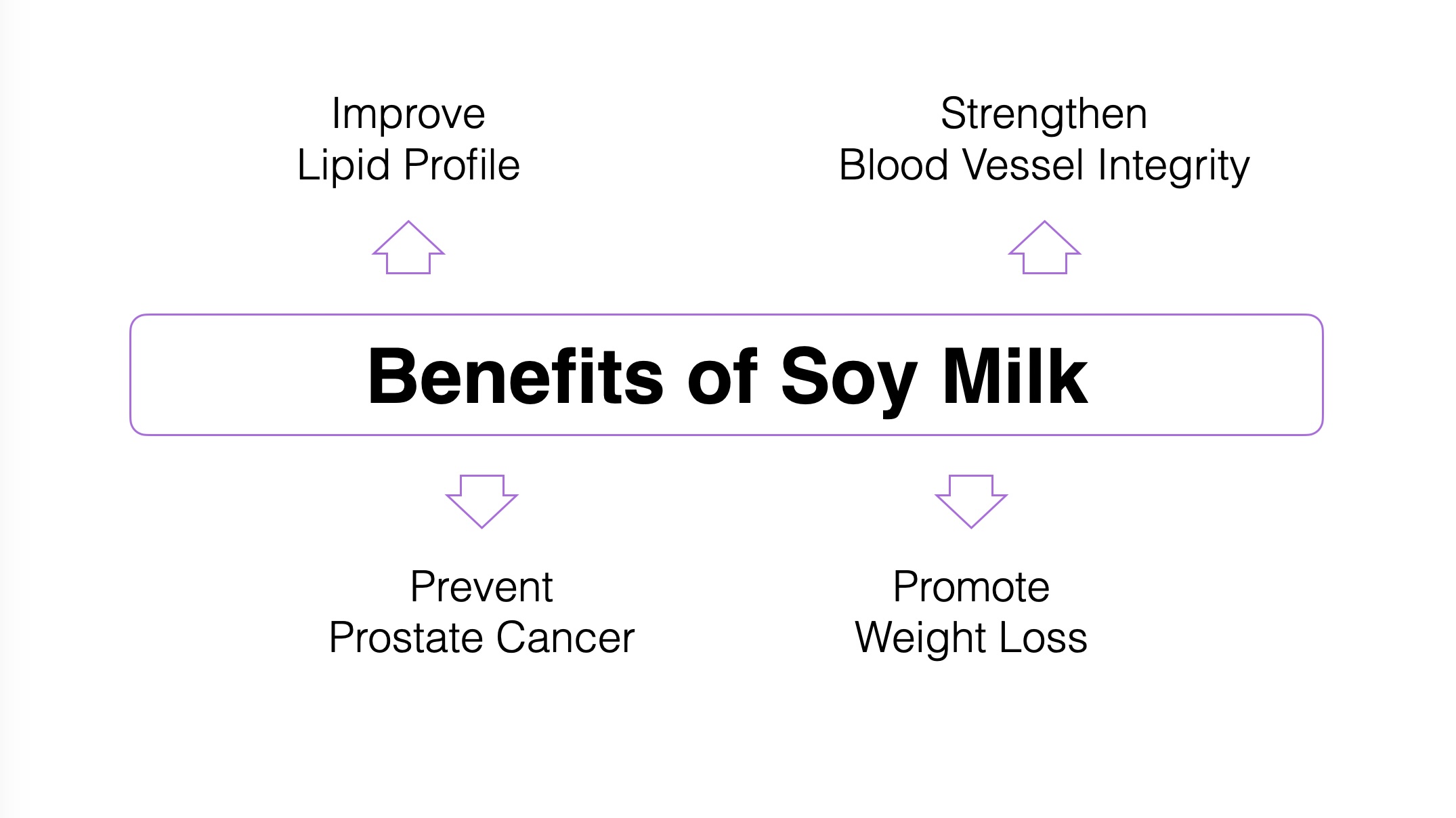
In this example, the box and arrows help organise the information and show its relationships, but their restrained colour keeps them visually secondary to the words.
This is another form of visual hierarchy.
Ask yourself:
What should the audience notice first, second and third?
Then use size, position, colour, contrast and space to reinforce that order.
Design the thinking, not just the slide
It is easy to begin slide design by choosing a layout and then fitting our information into it. Try reversing the process.
Start with the information. Decide what it means. Identify the key message. Work out how the supporting ideas relate to that message. Then design a visual structure that makes those relationships visible.
A slide doesn’t become effective simply because the elements are nicely aligned, the colours work together or the graphics look professional. Those things can improve the design, but they come after the thinking.
Don’t design the slide around the information you have. Design it around the relationship you want the audience to understand.
That’s the story behind the slide.


