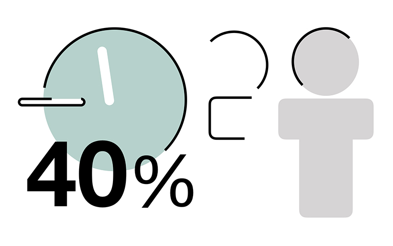
Presentations that are filled with text and data can be difficult for an audience to follow. When too much information is placed on a slide, the audience has to spend time reading and figuring out what is important while also trying to listen to the presenter.
Presentation slides should help the audience see and understand the message. One way to achieve this is to simplify the information and use simple infographic elements to give important information a visual form.
You don't need sophisticated illustrations or complex graphics to do this. Sometimes a few simple shapes, icons or visual elements are all you need to make information easier to recognise and the slide more visually engaging.
Simplify before you visualise
Let's start with a typical data-heavy slide.

The slide above contains the findings of a survey. There is useful information here, but presenting all the findings as text makes the audience work unnecessarily hard to identify what is important.
Before thinking about graphics, we should first decide what we actually want the audience to know.
Instead of showing all the raw information, we can extract the key findings and simplify the message.

The information is now much easier to see and understand.
This is an important first step. Adding infographic elements to an overloaded slide will not necessarily make it better. Simplify the information first. Then decide what can be visualised.
Turn information into something the audience can see
Once the message is clear, look at the information and ask:
Is there anything here that could be represented visually?
For example:
- 75% of employees could be represented by people figures.
- 11:45am could be represented by a clock.
- Three locations could be represented by location markers.
- A five-step process could be represented by five connected elements.
- An increase or decrease could be reinforced with a directional arrow.
- A sequence of events could be represented as a simple timeline.
The objective isn't to turn every piece of information into an icon. Look for visual elements that help the audience recognise or understand the information more quickly.
In our example, we can use a simple person figure and a clock to reinforce two pieces of information in the survey findings.
Simple infographic elements are often enough
Infographics don't have to be complicated.
Simple infographic elements can be created directly in PowerPoint or Keynote using basic shapes.
To create a person figure, for example, we can use a circle for the head and simple shapes for the body, arms and legs. Once the shapes are arranged, they can be grouped and resized as a single object.
A clock is just as simple. Start with a circle for the clock face, then use lines or narrow rectangles for the hands.

You don't need to be an illustrator. The objective is not to create a piece of artwork. The visual only needs to be simple, recognisable and appropriate for the information it represents.
If you use several infographic elements on the same slide, try to keep their visual treatment consistent. Similar colours, line weights and styles will help the elements feel like they belong together.
Use infographic elements to communicate, not decorate
Now let's add the person and clock to our simplified slide.

Compare this with the text-only version in Fig.2.
The infographic elements give visual form to the information and create additional points of interest without adding complexity. The person figure reinforces the information about employees, while the clock immediately gives visual meaning to the time.
This is the real value of simple infographics.
They are not there simply to decorate an empty space or make a slide look more colourful. A useful infographic element should support the message or help the audience recognise a number, category, sequence, relationship or idea.
Before adding any visual element, ask yourself:
Does this help communicate the information, or am I simply decorating the slide?
If removing the visual makes the information less clear or less immediate, the visual is probably doing a useful job. If removing it makes no difference at all, you may not need it.
Give it a try
The next time you have a slide filled with text or data, don't immediately start adding graphics.
First, identify the information that matters.
Simplify it.
Then look for parts of the message that can be given a simple visual form.
A few circles, rectangles, lines, icons or other basic elements may be all you need to turn an ordinary text-heavy slide into something that is easier to see, easier to understand and more engaging for your audience.
Keep it simple. Visualise with purpose.


