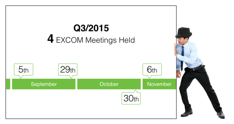
Dates and events often appear together in presentations: project milestones, launch schedules, implementation plans, programmes and important activities throughout the year.
A common approach is to place the dates and descriptions into a template and organise everything neatly on the slide.
The information may all be there, but that doesn't necessarily make it easy for an audience to follow.
When presenting dates and events, the audience is usually trying to understand something more fundamental:
What happens first? What happens next? And how does one event relate to another?
A visual timeline can make those relationships much easier to see.
Let the audience see the sequence
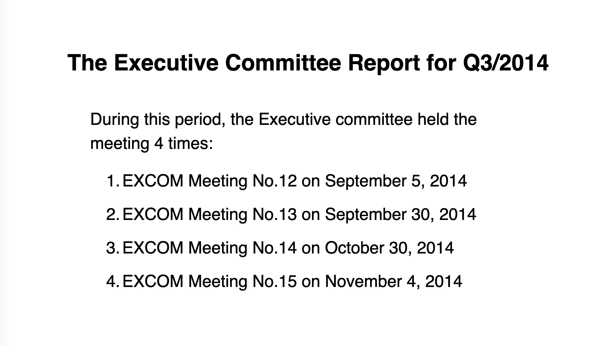
In the example above, the audience has to read through the individual dates and descriptions to reconstruct the sequence for themselves.
This type of layout may work reasonably well as a document because readers can take their time. During a presentation, however, the audience is also listening to the presenter.
Instead of simply organising the information into boxes, think about how the position of the information can help communicate the sequence.
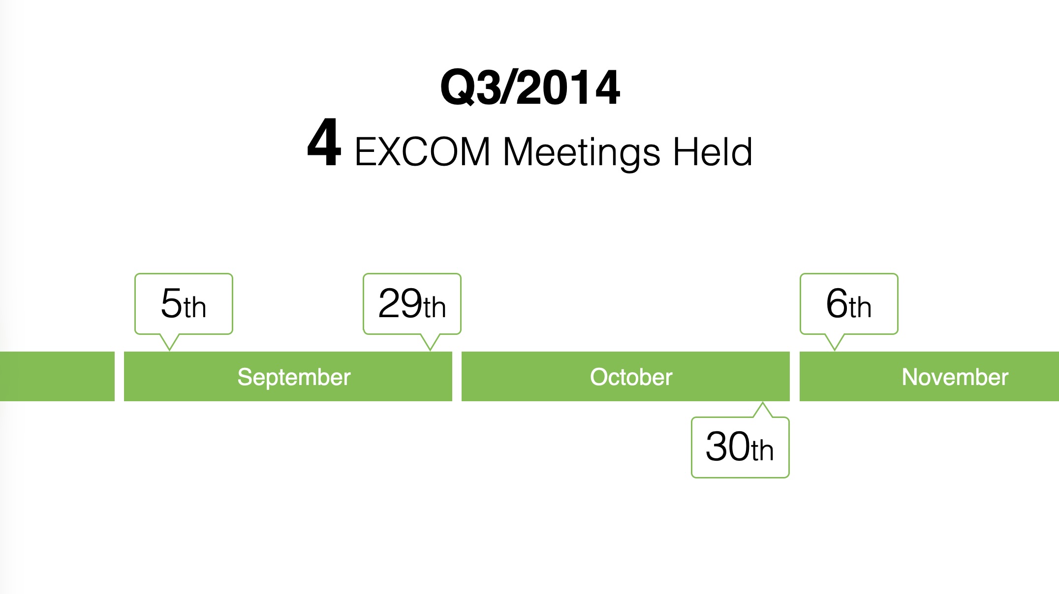
The same information can become much easier to follow when the dates provide visual anchors and the events are arranged along a clear progression.
Before reading every detail, the audience can already see that one event follows another. The timeline is therefore doing part of the communication for you.
This is an important distinction between information designed for reading and information designed for presenting. Don't make the audience read the slide to discover a relationship that you can show visually.
Don't squeeze everything onto one slide
There is another problem that often appears with timelines. As the number of dates and events increases, we try to make the entire timeline fit onto a single slide.
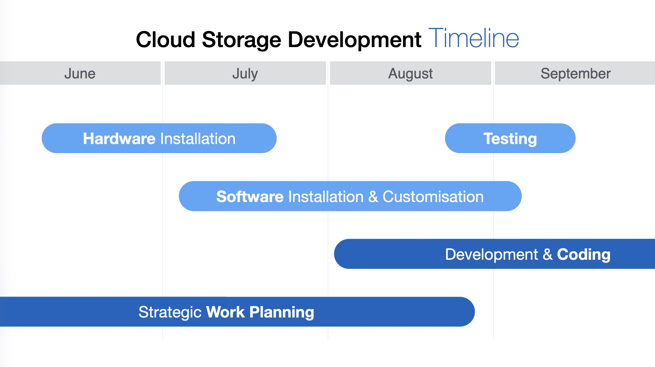
A timeline covering several months may technically fit on one slide, but the labels become smaller, the spacing gets tighter and the audience receives all the information at once.
There is no rule that says one timeline must occupy one slide.
If you are explaining the events progressively, divide the timeline into sections and give each section enough room.
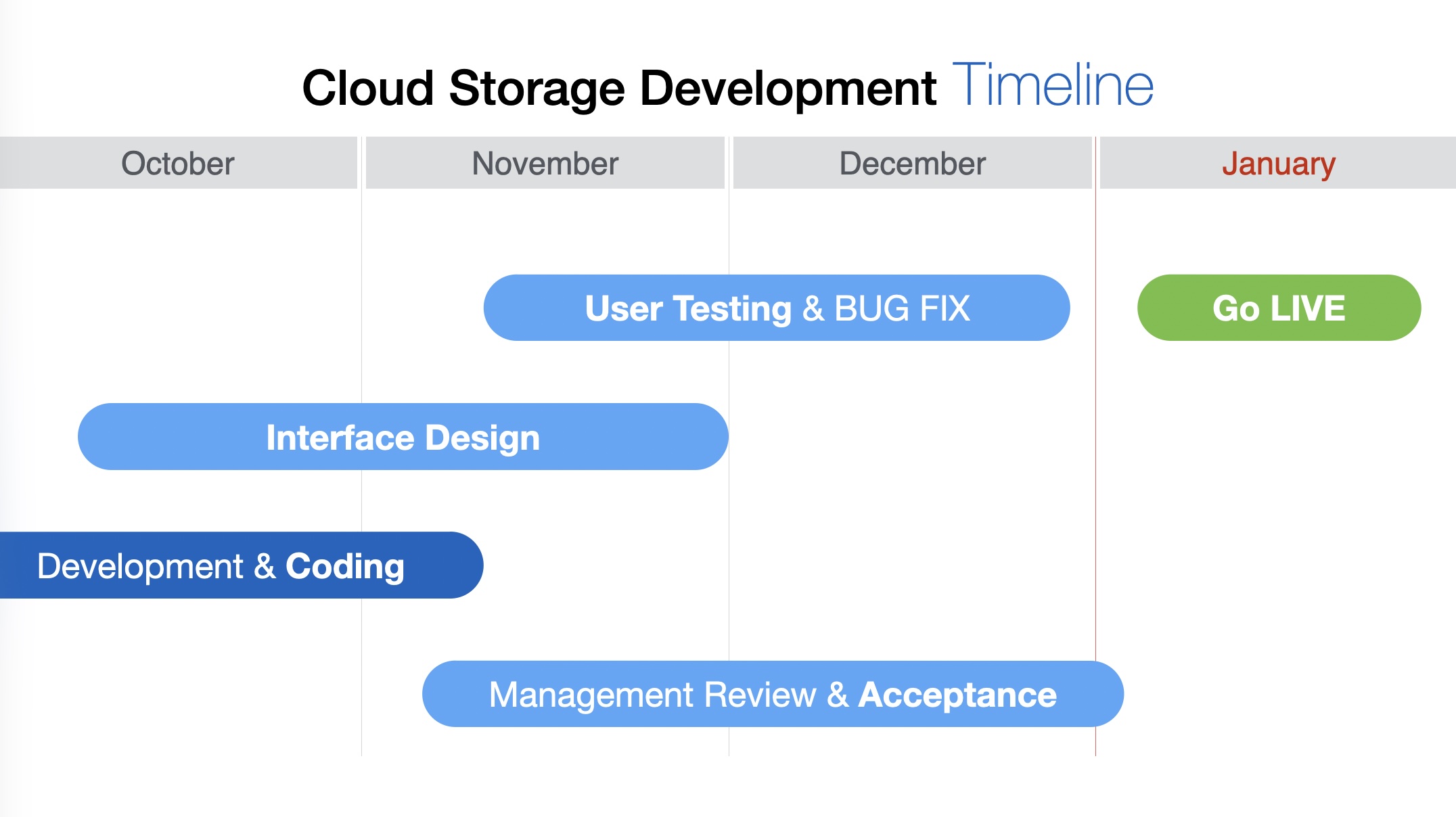
The second slide can continue naturally from the first. The audience sees the information for the period you are discussing rather than having to look ahead at everything that will happen later.
This gives the content more space and gives you greater control over when the audience sees each part of the story.
Use Push Left to continue the timeline
When the timeline continues onto the next slide, a simple Push Left transition can reinforce the relationship between them.
Instead of one slide disappearing and an unrelated slide appearing, the first section moves out to the left while the next section enters from the right.
The movement creates the impression that we are travelling forward along the same timeline.
The transition is doing more than adding movement. It communicates continuation.
The audience understands that they have not moved to a different subject or a different timeline. They are simply seeing the next part of the same sequence.
This is a good example of animation being used for a communication purpose rather than simply as an effect.
Reveal information as you explain it
Splitting a timeline across several slides also gives you another useful presentation technique: progressive disclosure.
Instead of showing the audience eight months of activities while you are still talking about the first two, reveal the information as you reach it.
This reduces the amount of competing information on screen and helps keep the audience's attention on what you are explaining now.
The same principle can be used for project schedules, implementation plans, event programmes, company histories, product roadmaps and other information organised around time.
The timeline can still represent one continuous sequence even though the audience sees it over several slides.
Design around the sequence
When presenting dates and events, don't begin by asking:
Which template should I use?
Start by asking:
What sequence does my audience need to understand?
Then design the slide around that sequence.
Use position to show progression. Give events enough space to be understood. If the timeline becomes too long, continue it across additional slides. And when appropriate, use a simple transition such as Push Left to make that continuation visible.
The objective is not simply to display all the dates.
It is to help the audience see how the events unfold over time.


