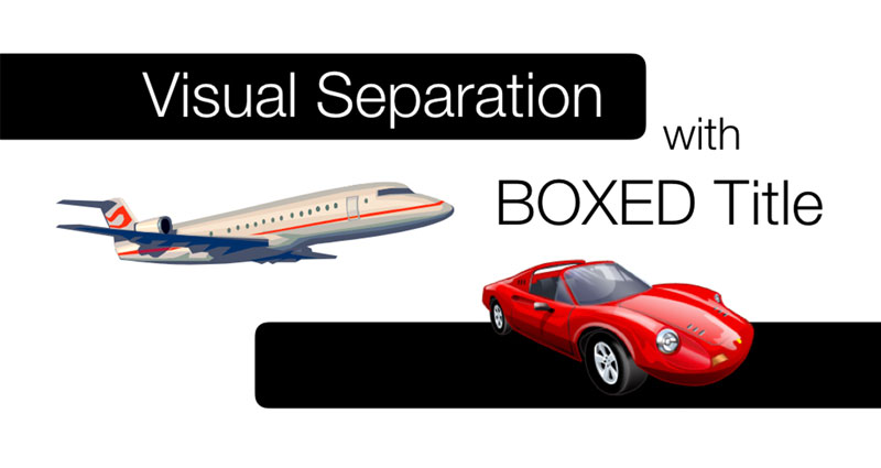
When designing a presentation slide, we often concentrate on the content—photographs, charts, diagrams, text and other visual elements. But the way the title relates to that content can also influence how quickly the audience understands the slide.
Look at the example in Fig. 1. The title sits above the content, but visually they occupy much the same space. There is little separation between the part that introduces the slide and the information that follows.

There is nothing technically wrong with this arrangement. But a simple visual adjustment can give the slide more structure and establish a clearer hierarchy.
Create separation with a simple box
One of the easiest ways to separate the title from the rest of the slide is to place it inside a simple rectangular box.

The box creates a visual container. It tells the eye that the title belongs together as one element and that the content below belongs to another area of the slide.
The box does not need elaborate styling. In most cases, a simple shape with a solid fill is enough. Shadows, gradients, bevels and other effects can easily turn a structural element into unnecessary decoration.
The objective is not to make the title box fancy. Its job is to create separation.
Position changes the character of the slide
A title box does not always have to sit in the centre. Moving it to the left or right can change the balance and character of the composition while preserving the same basic separation between title and content.


Moving the same boxed title to the left or right changes the balance and character of the slide while maintaining visual separation.
A centred title often feels balanced and conventional. A title positioned towards the left can create a stronger sense of direction, particularly when other elements follow the same alignment. Moving it towards the right introduces asymmetry and can help balance content occupying the opposite side of the slide.
None of these positions is automatically better. The appropriate position depends on the rest of the composition.
Instead of asking, Where should a title box normally go?, look at the complete slide and ask:
Where can the title sit so that it feels connected to the composition while remaining clearly separated from the content?
How much separation does the title need?
Separation is not an all-or-nothing decision. Fig. 4 develops the same title through four increasingly strong treatments. The appropriate choice depends on how much structure the slide needs and how prominent the title area should become.


As the treatment becomes stronger, the title moves from being an object placed on the slide to becoming part of the slide's structure. That does not make the strongest treatment the best one in every situation. A full-width band can provide useful organisation, but it can also occupy more visual attention than a simple outline.
The objective is not to put every title inside a rectangle. The objective is to create a clear visual relationship between the title and the content.
Use the title treatment to structure groups
The title area can do more than identify the subject of a slide. It can help the audience recognise how different groups of content are organised. In Fig. 5a, the title sits between two groups but remains on the same white visual field. The coloured band in Fig. 5b creates a deliberate division while keeping the title connected to both groups.


The band is useful here because it performs an organisational job. It is not simply decoration around the words. The title becomes the boundary that helps the audience read the upper and lower content as related but distinct groups.
Organise supporting information and the main message
The same principle can establish hierarchy between evidence and conclusion. In Fig. 6a, the supporting information and statement occupy the same white field. Fig. 6b gives the main message a full-width coloured region below the evidence, making the relationship between the two levels immediately clearer.


This treatment works because it reflects the information hierarchy: supporting material above, main message below. Colour and position reinforce the distinction without requiring more explanation or additional data.
Create consistency without forcing every slide to look the same
Across a longer presentation, repeated title positioning, spacing or visual treatment can help the audience become familiar with the structure. They do not need to work out where the title ends and the content begins on every slide. This can be especially useful in corporate presentations, training materials and longer decks containing several types of information.
Consistency does not mean every slide must use an identical box. A full-screen photograph, quotation, section divider, big-number slide or strong statement may need a different treatment. The title area should respond to the composition: it might balance content on one side, reinforce an existing horizontal structure or create a boundary between information groups.
Create consistency where it helps the audience. Vary the treatment deliberately when the content calls for a different relationship.
Don't let the title treatment become the message
There is also a point where visual separation becomes too strong.
A large block of intense colour, a thick border or an oversized title can dominate the slide so strongly that the content becomes secondary.
If the audience notices the title treatment before they understand the message, the design may be doing too much.
A useful test is to temporarily remove the box or band and look at the slide again. Does the treatment improve the organisation and hierarchy, or is it simply decoration?
If it does not help the audience understand how the slide is organised, it may not be necessary.
Small adjustment, broader principle
Putting a title inside a simple box may seem like a small design adjustment. But the principle behind it is much broader.
Good slide design depends on helping the audience recognise what belongs together, what should be separated and where they should look first.
A box can do that. So can colour, spacing, alignment, position and contrast.
The important thing is not the box itself. It is the visual relationship the box creates.
The next time you design a slide, don't just look at the title and ask whether it looks attractive. Look at the title together with everything else on the slide and ask:
Does my audience immediately understand where the message begins and how the content is organised?


