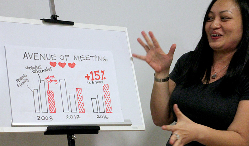
What makes a presentation slide high impact?
Some people may point to its colours, layout, animation, photograph or polished appearance. These elements can contribute to the design, but none of them guarantees that a slide will work. A beautifully produced slide can still confuse the audience, while a simple slide can be powerful when its message is immediately clear.
A high-impact slide helps the audience understand one important idea quickly and remember why it matters.
Achieving that impact requires more than knowing how to operate PowerPoint. It begins with deciding what the audience needs to understand, removing information that competes with that purpose and choosing a visual form that makes the idea easier to see.
PowerPoint does not decide what the slide should communicate
Presentation software provides the tools for arranging words, images, charts and shapes. It can help you produce the finished slide, but it cannot decide whether the message is relevant, whether the evidence is convincing or whether the audience will understand the idea.
You do not need to master every PowerPoint feature before you can design effective slides. Once your thinking is clear, a relatively small collection of familiar tools—text, images, shapes, alignment and simple charts—can produce a wide range of useful slides.
The difficult work often happens before the software is opened. It involves understanding the audience, defining the objective, organising the reasoning and deciding what each slide needs to accomplish.
Begin with the outcome, not the slide layout
Before building slides, decide what the presentation needs to achieve. What should the audience understand, believe or do when it ends?
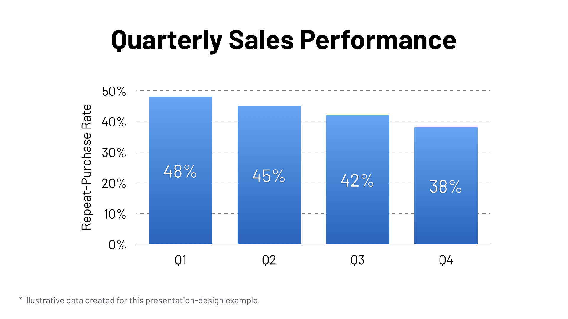
A broad topic does not provide enough direction. “Quarterly sales performance” describes a subject, but it does not tell us what the presentation needs to communicate. A more useful objective might be: “Show why the decline in repeat purchases requires immediate attention.”
The clearer objective helps you decide what evidence belongs in the presentation. It also makes it easier to recognise interesting information that does not support the intended outcome.
A slide becomes focused when every element has a reason to be there.
Give each slide one primary message
A slide may contain several pieces of information, but the audience should be able to identify the main point. If every number, sentence and image demands equal attention, viewers have to work out the meaning while also trying to listen to the presenter.
Ask a simple question before designing each slide: what does this slide need to help the audience understand?
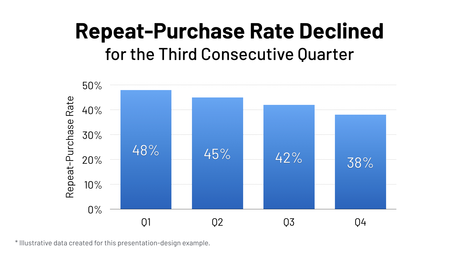
The answer can become a message-led title. In the following example, “Quarterly Sales Performance” identifies only the general subject. “Repeat-Purchase Rate Declined for the Third Consecutive Quarter” states the conclusion the audience should notice. Both slides use exactly the same chart and data, allowing us to see how the title alone changes the way the evidence is understood.
This does not mean that every presentation slide must use an identical layout or contain only one object. It means that the different elements should work together to support one primary idea.
Remove anything that competes with the message
Slides often become cluttered because information is added more easily than it is removed. A logo is repeated, several paragraphs are copied from a report, every available number is placed in a chart and decorative graphics are introduced to fill empty space.
More content does not necessarily make a slide more informative. It can make the useful information harder to find.
When reviewing a slide, ask:
- Does the audience need this information at this moment?
- Does it support the slide's main message?
- Could I explain it verbally instead of displaying it?
- Would removing it change the meaning?
- Is it evidence, context or merely decoration?
Removing unnecessary content creates room for the important content to become larger, clearer and easier to recognise. Simplicity is not the absence of substance. It is the result of making deliberate choices.
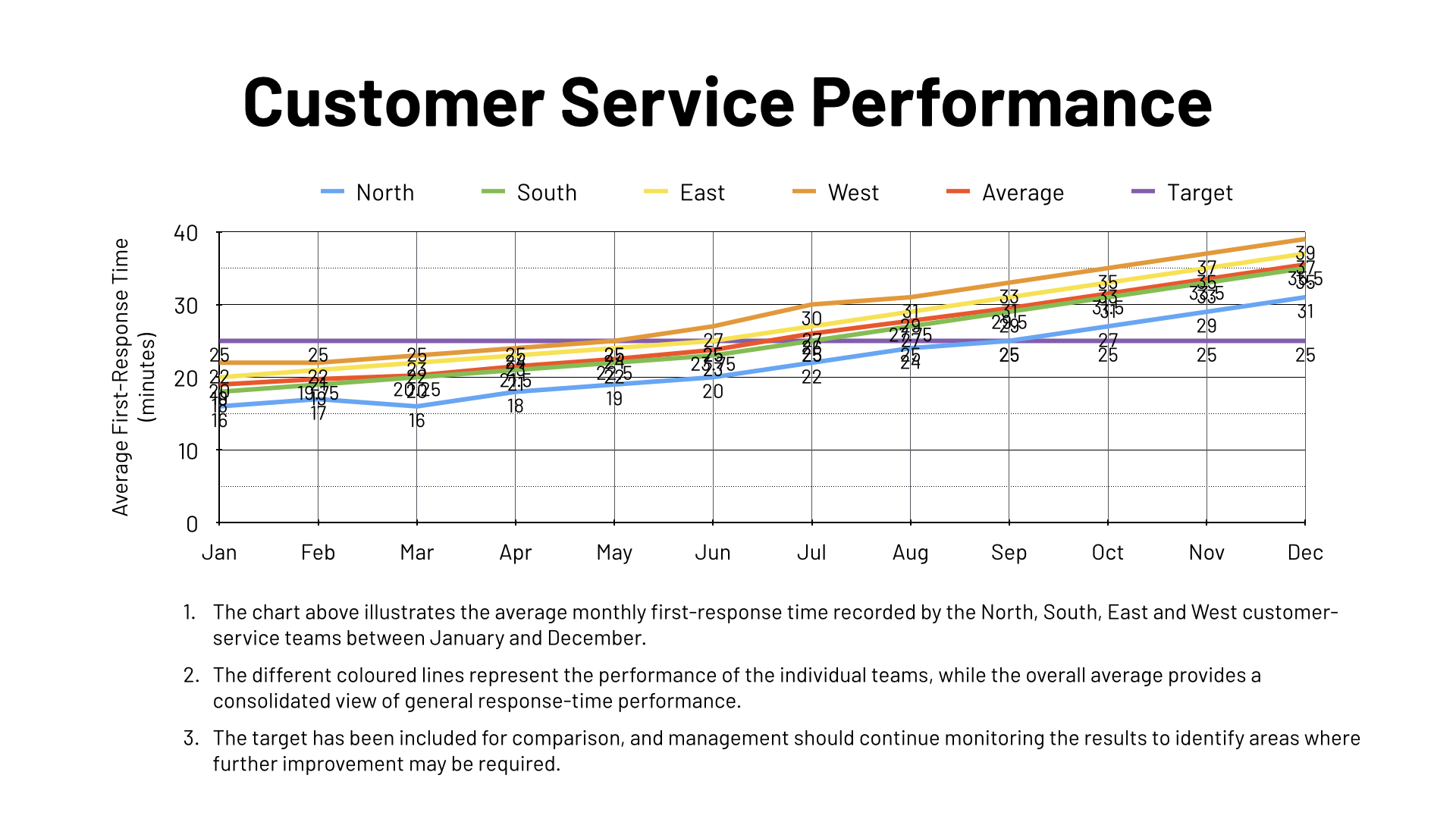
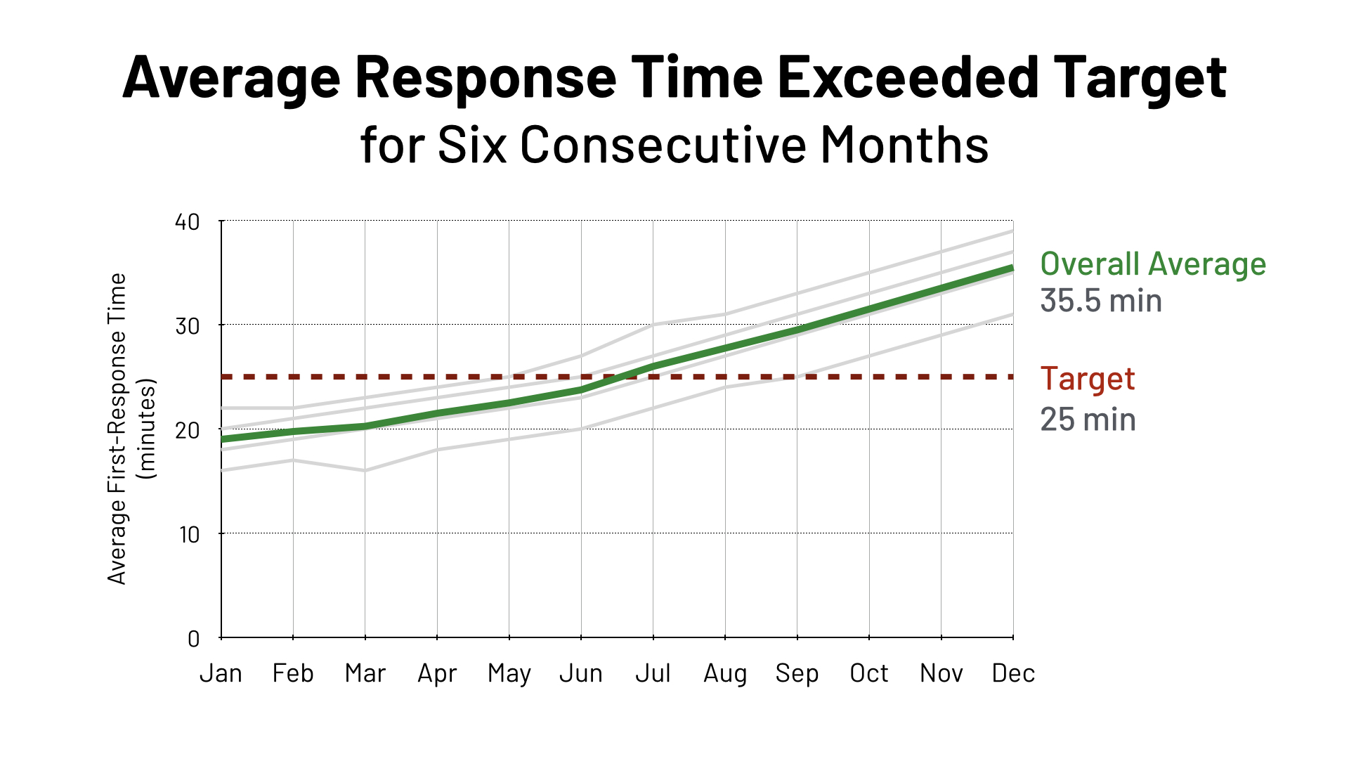
The following slides use the same customer-service data. The first attempts to display and explain everything. The second retains the underlying evidence but gives visual priority to the overall average, the target and the conclusion they support.
Create a visual hierarchy
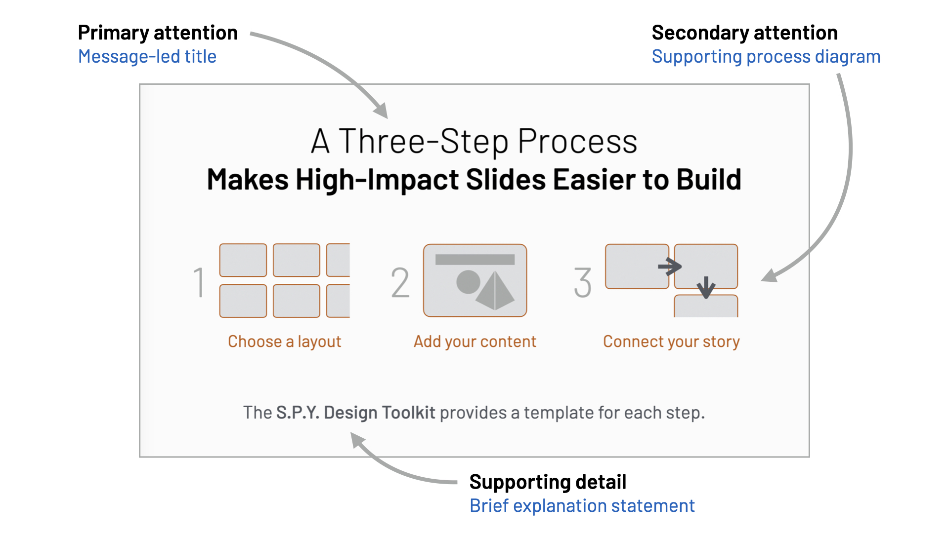
Once the content has been selected, design should guide the audience through it. Visual hierarchy tells viewers where to look first, what to notice next and which details provide support.
Size, position, contrast, colour and spacing can all create hierarchy. A clear message may appear as the largest text. The most relevant part of a chart may use a contrasting colour while the remaining data is quieter. Related items can be placed together, and sufficient space can separate one group from another.
Highlighting everything produces the same result as highlighting nothing. When several colours, large numbers and bold labels compete for attention, the audience receives no useful direction.
Good visual design does not merely make a slide attractive. It makes the intended order of attention visible.
Turn information into something the audience can see
We are accustomed to using sentences and paragraphs to express ideas. That form is appropriate for reports and documents because readers can move through the material at their own pace. During a presentation, however, the audience must divide its attention between the speaker and the screen.
Instead of placing the complete explanation on a slide, consider the structure of the idea:
- A sequence can become a series of steps.
- A comparison can become two aligned groups.
- A trend can become a clear chart.
- A relationship can become a diagram.
- A location can become a map.
- A physical subject can be shown with a photograph or illustration.
The visual should make a useful relationship, pattern or difference easier to recognise. Replacing words with an unrelated stock photograph does not automatically improve communication. The image must contribute meaning.
Sometimes the clearest slide is simply a short statement or one significant number. The form should follow the idea rather than a rule that every slide must contain a picture.
Design slides to support the speaker
A presentation slide is not the complete presentation. The speaker provides context, explanation, examples and interpretation. The slide helps the audience follow that explanation by displaying what is most useful to see.
If the slide contains every sentence you intend to say, the audience is encouraged to read instead of listen. At the other extreme, removing so much that the screen contributes nothing meaningful gives the audience no visual support for the explanation.
A minimal slide works when its single statement, image or number has a clear role. The objective is not simply to display fewer elements, but to show the content that will genuinely help the audience follow the presentation. The right balance depends on the subject, audience and situation.
Ask what must remain visible while you speak. It may be a diagram whose parts you explain, a chart whose comparison you discuss, a quotation you want the audience to consider or a few keywords that organise a process.
Plan the presentation on paper
Before producing finished slides, sketch the presentation as a storyboard. Each box represents a slide and records its main message, proposed visual and role within the larger explanation.
Drawing rough ideas encourages you to think in diagrams, relationships and visual blocks instead of automatically filling a default PowerPoint layout with bullet points. The sketches do not need to be attractive. Their purpose is to make the thinking visible while it is still easy to change.
Looking at the entire storyboard also reveals problems that may be difficult to notice while editing one slide at a time:
- an important step may be missing;
- two slides may repeat the same idea;
- one section may be disproportionately long;
- a transition may feel abrupt;
- the conclusion may not resolve the opening problem.
Moving or replacing a rough storyboard card takes very little time. Rebuilding several polished slides after discovering a structural problem takes much longer.
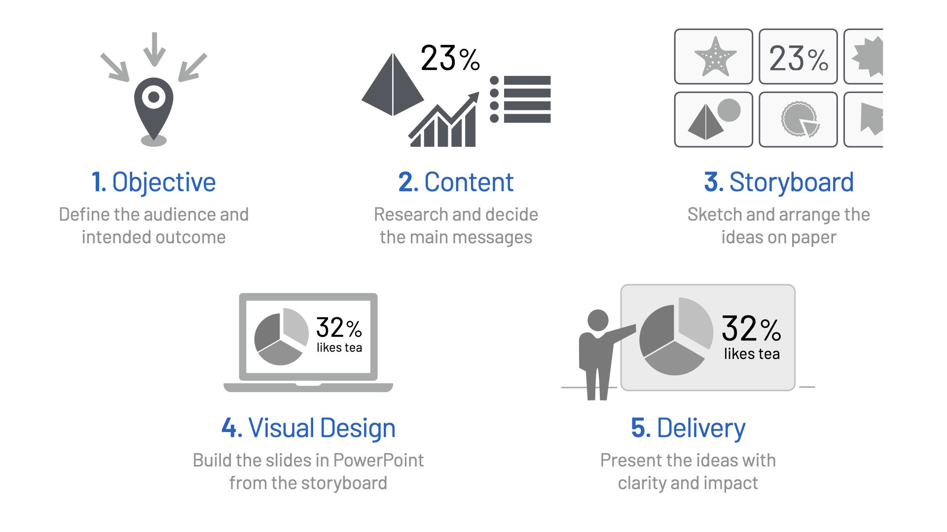
This thinking process is captured in the S.P.Y. Five-Step Presentation Design and Planning Framework: Objective, Content, Storyboard, Visual Design and Delivery. PowerPoint enters during Visual Design, after the intended outcome, main messages and presentation flow have already been developed.
Test the slide from the audience's viewpoint
A slide can appear perfectly clear to its creator because the creator already understands the information. The audience sees it for the first time while listening to an explanation.
Before accepting the design, test it with these questions:
- Can the main message be identified within a few seconds?
- Can the important content be read from the expected viewing distance?
- Does the visual support what the presenter will say?
- Is the most important evidence easy to locate?
- Is anything competing unnecessarily for attention?
- Does this slide help the presentation move towards its objective?
If possible, show the slide to someone unfamiliar with the presentation. Ask what they noticed first and what they believe the slide is communicating. Their response may reveal a gap between your intention and the visible result.
Clarity creates the impact
High-impact slides do not begin with effects, templates or decoration. They begin with a clear communication objective and a disciplined decision about what the audience needs to see.
Define the outcome. Give every slide a primary message. Remove content that does not support it. Establish a visual hierarchy, turn suitable information into meaningful visuals and review the complete presentation as a connected story. Then use PowerPoint to produce the slides.
The software helps you build the slide. The clarity of your thinking gives it impact.


