
Put yourself in the shoes of your audience. After sitting through a presentation, how much of it are you really going to remember?
Probably not every sentence, every number or every slide. What people are more likely to remember are the ideas that were clear enough to understand and simple enough to stay with them. Yet many presentation slides make the audience work unnecessarily hard. They are filled with paragraphs, bullet points, small text and several competing messages.
The challenge is not simply to make slides look better. It is to decide what matters, then find a clear way to show it.
When you design information for the audience to see, rather than simply giving them information to read, you make the important ideas easier to recognise and understand.
Here are five simple ways to do that.


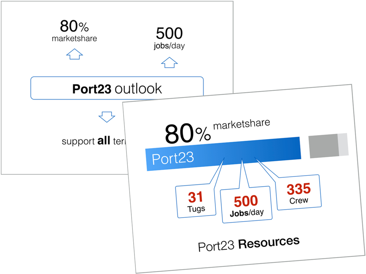
Searching for those keywords forces you to analyse the information and decide what the audience really needs to take away. In this example, the redesigned slide extracts the important information from paragraphs, bullet points and a table, then turns it into a visual structure.
The audience no longer has to search through the slide to discover what is important. You can provide the explanation while you present; the slide doesn’t have to contain every sentence you intend to say.
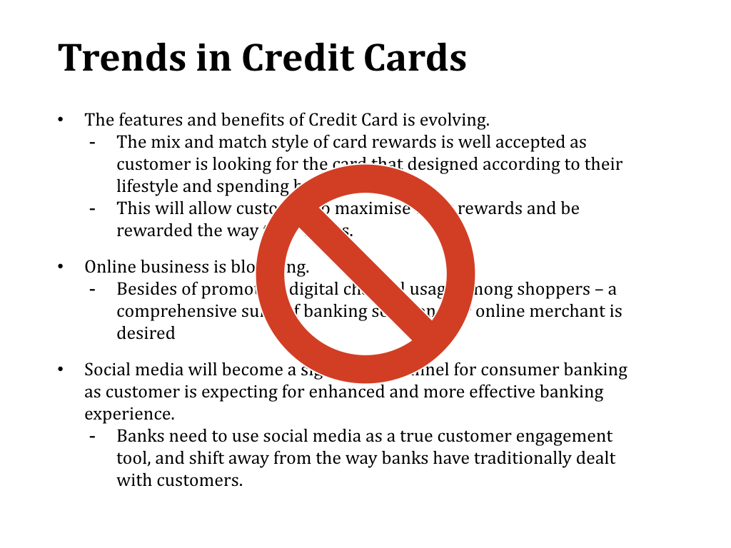
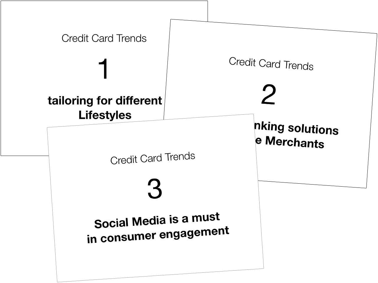
If a slide contains three important messages, the audience has to decide where to look, what to read and which point matters most.
The redesigned example separates the credit-card trends into three messages: tailoring for different lifestyles, banking solutions for merchants, and the importance of social media in consumer engagement. As each idea is discussed, the audience has one clear message to focus on.
This doesn’t mean every slide must contain only a few words. The principle is to avoid making several important messages compete on the same slide. Sometimes three simple slides are better than one complicated slide.
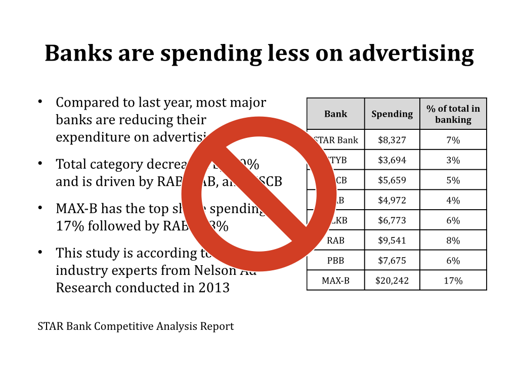
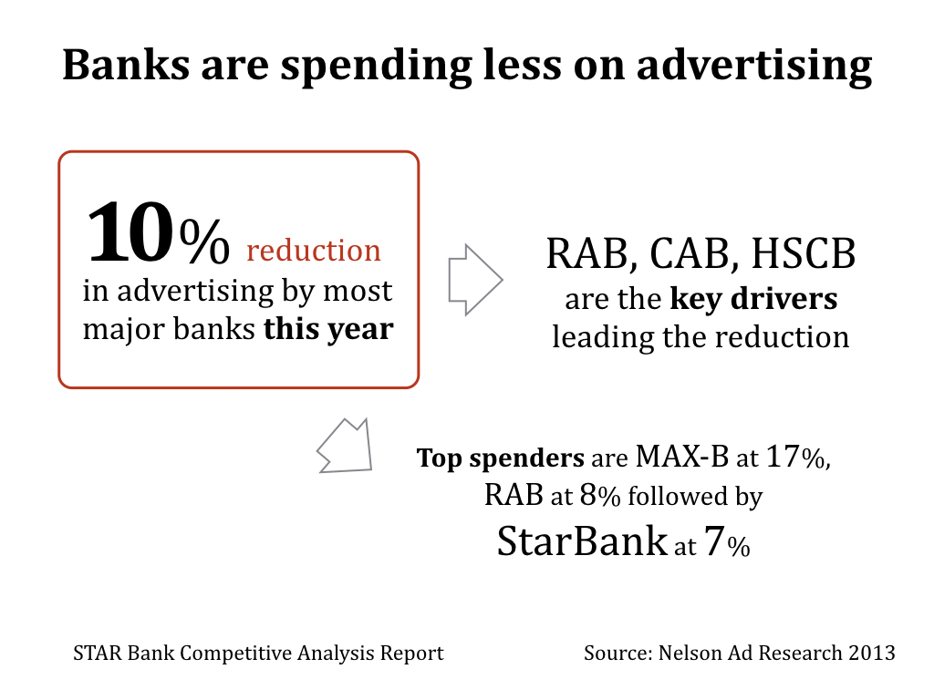
Some points belong together, some are more important, and some explain another point.
In the redesigned example, the key finding—10% reduction in advertising by most major banks this year—is given prominence. Supporting observations are positioned as separate pieces of information around it, allowing the audience to see the structure before reading every word.
Instead of asking how to format the bullet points, ask how the pieces of information are related. Then use position, size, spacing and grouping to make that relationship visible. A block doesn’t have to be a literal box; it means treating related information as a visual unit.


This is particularly true when an idea involves a process, relationship, sequence, movement or connection.
The original slide explains an app connecting merchants and subscribers through several bullet points. The visual version makes the relationship visible: merchants provide offers through the app, and the app sends notifications to subscribers.
Your drawing doesn’t need to be artistic. Start with simple shapes, arrows, lines, icons and labels. The objective isn’t decoration; it is to find a visual structure that explains the idea. Sketching can also reveal whether you really understand how the parts fit together.
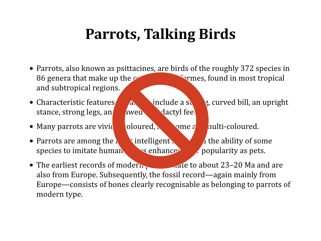

In the original example, the audience is given a block of information about parrots. The redesigned slide uses photographs to establish the subject immediately and create a strong visual impression. The presenter can then provide the explanation.
A good image can make an idea more concrete, provide context, create emotion or give the audience something memorable to associate with the message. Choose carefully: a generic or inappropriate image can contribute very little or distract from the message. Use images when they strengthen what you want the audience to see, understand or remember.
Give your audience something to remember
Approaching presentation slides visually may require more thinking before you start designing. That’s a good thing.
The objective isn’t to decorate information after you’ve finished writing it. It is to think about what the audience needs to understand and find the clearest way to communicate it.
Use keywords to sharpen the message. Give important ideas their own slide. Arrange related information into visual blocks. Draw relationships when a diagram can explain them better than paragraphs. And use images when they strengthen the idea.
Your audience may not remember every slide you show them. But give them something clear to see and understand, and you give the important ideas a better chance of staying with them.


