
When every photograph is placed perfectly straight and evenly spaced, a slide can feel orderly and easy to follow. But an arrangement that is too orderly can also become predictable—especially when the photographs are intended to communicate activity, personality or an informal moment.
This does not mean that order is a problem or that every photograph should be made crooked. The opportunity is to introduce a little controlled irregularity: begin with a clear structure, then allow selected elements to break it deliberately.
Too much order can become predictable
The design in Fig. 1 is not wrong. It is clear, balanced and organised. The photographs align neatly, and the grid makes their relationship easy to understand. However, because every photograph behaves in exactly the same way, the arrangement can also feel predictable.

Change one element to change the character
Fig. 2a rotates only the centre photograph. That one change breaks the repeated pattern and introduces movement, while the underlying grid remains easy to recognise. The surrounding photographs continue to provide stability.
You do not have to change everything to change the character of a slide. A selected irregularity can be more effective than rotating every image because the contrast between aligned and rotated elements makes the change visible.

Why 5 degrees?
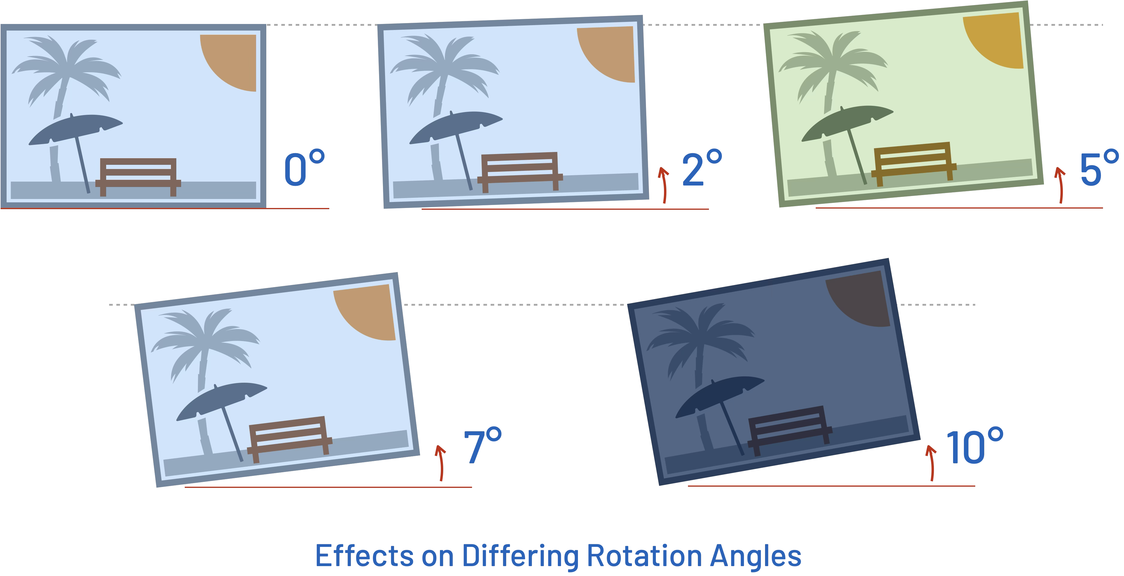
Fig. 2b compares several rotation angles. At 2°, the change is subtle and may be enough when the slide needs only a gentle shift. Around 5°, the photograph clearly breaks the rigid alignment without allowing the angle to dominate the composition. This makes 5° a useful recommended balance.
At 7°, the rotation becomes stronger. By 10° and beyond, the angle can begin attracting attention to itself rather than supporting the photograph. More extreme rotation is another valid visual-design treatment, but it sits outside this particular technique.
Five degrees is not an absolute rule. The key is to use enough rotation to break the order, without allowing the rotation to dominate the design.
Frames and shadows can reinforce the effect
In Fig. 3a, the photographs have a simple white frame and subtle shadow. This treatment makes them feel more like physical photographs placed on the slide. Rotation makes their edges—and therefore their physical-photo character—more apparent.
Frames and shadows are not compulsory. If the photographs already have clear edges or the slide needs a clean, flat appearance, rotation alone may be enough. Use the treatment only when it strengthens the intended visual character.

Controlled irregularity still needs structure
The technique does not have to be limited to a single photograph. As Fig. 3b demonstrates, selected photographs can be rotated to create a more informal arrangement while the overall composition remains structured. The rotations do not need to be identical, but enough aligned structure should remain for the arrangement to feel composed rather than random.
Breaking alignment does not mean abandoning structure. Position, overlap and rotation should support the overall composition together. Decide which photographs should remain stable and which selected images should introduce movement.

Take the idea beyond rotation
Fig. 4 moves beyond the original grid. The photographs now vary in size, position, overlap and alignment as well as rotation. Rotation is only one tool within the larger composition.
Despite breaking the original grid, the slide still has hierarchy and intentional structure. The larger caterpillar photograph establishes the starting point, the title anchors the message, and the butterfly photographs build a visual progression around it. The composition is freer, but it is not accidental.

Use the technique when the message suits it
A less formal photo treatment may suit slides about people, events, travel, workshops, memories or creative work. It may be less appropriate when the subject needs to feel precise, restrained or highly formal. The design choice should support the tone of the message rather than being applied automatically.
Before rotating a photograph, ask what the change contributes. Does it create useful movement? Does it make the arrangement feel more natural? Does it guide attention or improve the composition? If it merely makes the slide busier, leave the photograph straight.
Structure first, irregularity second
Start with structure. Keep the slide organised. Then decide where selected elements can break that structure deliberately.
The objective is not to make the slide untidy. It is to make the irregularity look intentional. When size, position, overlap, alignment, rotation and any supporting treatment work together, an orderly slide can gain energy without losing its composition.


