
Images can make presentation slides more engaging, but choosing an image is only part of the job. The image also needs to support the message, work with the other elements on the slide and remain clear when projected on a large screen. A photograph may look perfectly good on its own and still be the wrong image for a particular slide.
The objective isn’t simply to find an attractive image. It is to find an image that helps communicate the idea and works as part of the complete slide. Here are five practical things to consider when selecting and placing images in your presentation.
1. Start with image quality
A small image may look perfectly acceptable when you first find it. The problem often becomes obvious only after you enlarge it to fill a presentation slide.


Compare the two examples. The subject and composition are essentially the same, but the low-resolution version becomes soft and pixelated when enlarged. The preferred version retains enough detail to remain clear at presentation size. This matters particularly when an image occupies a large part of the slide. The larger you intend to display it, the more image quality matters.
Don’t judge an image only by how it looks as a small preview. Place it on the slide and view the slide at presentation size. If the image begins to look blurred or pixelated, find a higher-resolution version rather than trying to disguise the problem with effects.
2. Choose an image with a clear visual focus
An image can be relevant to your topic and still be difficult to use. Busy photographs contain several elements competing for attention. The audience may have to search the image before understanding what they are supposed to notice.


Both photographs may relate to the subject of meetings in a cafeteria, but they don’t communicate with equal clarity. In the first example, several visual elements compete for attention. Reflections, people and objects make it difficult to know where to look. The photograph becomes visual noise around the statistic. The preferred image gives the eye a clearer subject. The woman at the table immediately establishes a cafeteria or informal meeting setting, while the composition gives the statistic enough visual breathing room.
When choosing between several relevant images, don’t ask only: “Does this picture match my topic?” Also ask: “What will the audience notice first?”
A useful presentation image usually has a clear visual focus that supports rather than competes with the message.
3. If you’re adding text, look for usable space
A photograph may be excellent on its own but become difficult to use once you add a headline or other information. If you know that text needs to appear over an image, consider the composition of the photograph before choosing it.


The first photograph may work perfectly well on its own. The problem appears when we try to place the message on it. The background behind the text contains too much detail and variation, so the words have to compete with the photograph. The preferred image contains an area of relatively open sky. This gives the message a natural place to sit without covering the main subject or requiring a large box behind the text.
When you know that words must appear on an image, look for negative space—an area with relatively little visual detail that can accommodate the text. Also think about where that space is located. If your layout requires the headline at the top, an image with clear space only at the bottom may not solve the problem.
Choose the image with the final slide composition in mind.
4. Match the image style to the presentation
Choosing the correct subject isn’t enough. The visual style of the image also communicates something.


The subject is the same in both examples: air travel. But the visual treatment creates a very different impression. The cartoon aircraft feels informal and generic. For a business presentation discussing growth in air travel, the photograph gives the subject greater visual presence and is more consistent with the tone of the message.
This doesn’t mean photographs are always better than illustrations. A well-designed illustration may be exactly right for an educational, conceptual or deliberately informal presentation. Illustration can also be useful when you need to simplify an idea or show something that would be difficult to photograph.
The important question is whether the style of the image supports the tone and purpose of the presentation. Avoid choosing an image merely because it represents the correct object. Consider what its visual style communicates as well.
5. Give an image enough separation when it needs it
Sometimes an image needs a little separation from the rest of the slide, particularly when the image and slide background have similar tones. A simple border, frame or subtle shadow can help define the edge of the image.

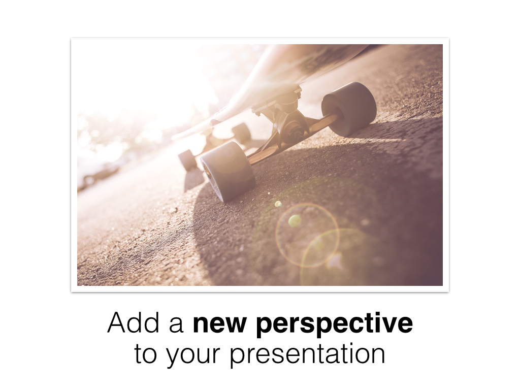
Compare the two examples. In the first, the photograph sits directly against the white slide and its edges don’t feel clearly defined. In the preferred version, a subtle border and shadow give the photograph enough separation to establish it as a distinct visual element.
The key word is subtle. A border or shadow shouldn’t become decoration that draws attention to itself. Use it only when it helps define the image or clarify the layout.
And don’t automatically frame every photograph. A full-bleed image, an image deliberately cropped to the edge of the slide, or a photograph already separated clearly from its background may need no border at all. Treat the image according to the role it plays in the composition.
Choose images for the slide, not just the subject
Finding a photograph that matches your topic is only the beginning. Look at its quality. Look at where the audience’s attention will go. Think about where your text needs to sit. Consider whether the visual style is appropriate for your message, and decide whether the image needs separation from the rest of the slide.
Most importantly, evaluate the image as part of the complete slide, not in isolation. A beautiful photograph isn’t automatically a good presentation image. The right image is one that helps the audience see and understand the idea you want to communicate.


