You may have come across a widely repeated claim that 90% of the information transmitted to the brain is visual. Another often-cited figure suggests that high-quality infographics may be many times more likely to be read than text articles—sometimes quoted as much as 30 times more likely.
These figures have been interpreted and repeated in different ways, and their original sources are not always clear. We should therefore be careful about treating the exact numbers as established facts. Even so, the popularity of these claims points towards a useful practical observation: visual information can often attract attention and make patterns, relationships and comparisons easier to recognise.
This leads to the question I explore in the video: should we include infographic elements as part of our presentation slide design?
We encounter infographics every day
Infographics appear in news reports, magazines, technical journals, business documents and presentations. They come in many forms, from a simple icon beside a number to a detailed visual explanation containing charts, illustrations and data.
Pictures, graphics and illustrations can make us more willing to look at information. When visual elements represent words or data meaningfully, they can bring the information to life and make a subject that initially appears dry or complicated more approachable.
That does not mean that anything with icons and colour becomes a useful infographic. The visual elements must help communicate something.
Visual storytelling combined with data
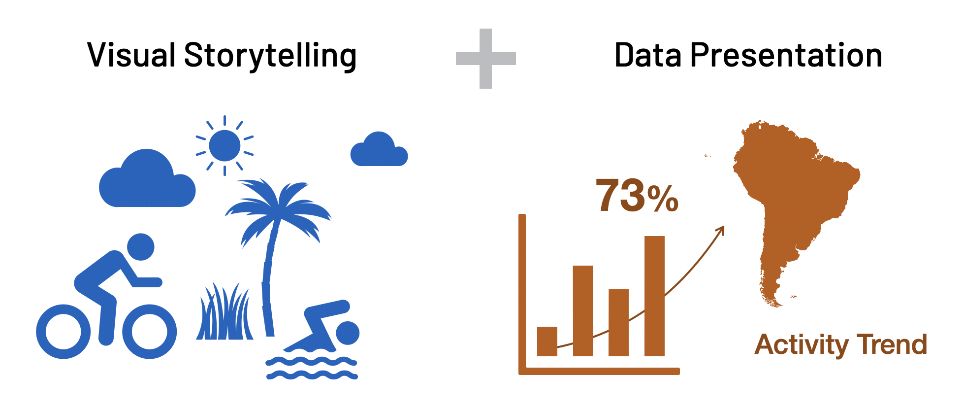
In the video, I describe an infographic as a combination of visual storytelling and data presentation. Information is transformed into graphic elements that tell a story, while key data is included clearly enough to support that story.
This combination matters. Data without visual structure may require too much effort to interpret. Visuals without meaningful information may be attractive but empty. An effective infographic brings the two together so the audience can see both the idea and the evidence supporting it.
Infographics can be used to visualise a story, educate and inform an audience, or communicate an idea or brand. For presentation slides, the purpose should determine what is shown and how much detail is needed.
Watch the video before exploring the examples further
The video introduces these principles and then demonstrates how a simple infographic person can be constructed directly in PowerPoint. You can watch it now for the complete visual sequence, then continue reading for a closer examination of the ideas and examples shown.
Good infographic design still requires visual-design principles
There are good infographics and bad infographics. Adding more information or more graphic elements does not necessarily improve the result. Without a basic understanding of visual design, an infographic can quickly become crowded and confusing.
The video highlights four considerations:
- White space: give elements room to breathe so that groups and sections are easier to distinguish.
- Font size: make important words and figures large enough to be read, especially when the infographic appears on a presentation screen.
- Colour harmony: use colours that work together and apply them consistently.
- Contrast: separate important information from its background and from less important elements.
These are not additions made after the infographic is complete. They influence whether the audience can understand it at all.
Presentation infographics need simplicity
An infographic for a webpage, poster or report can contain details that readers inspect at their own pace. A presentation slide works differently. The audience is looking at the screen while also listening to the presenter, and the slide may be visible for only a short time.
For that reason, the principles used to create clear presentation slides also apply to infographic slides. The design must be simple, focused and large enough to understand from a distance. If an infographic contains too much information, divide it into smaller segments and present them over several slides.
The employee lunch-preference example
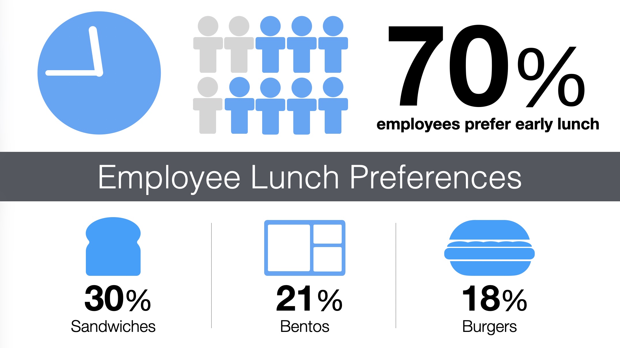
The video uses an employee lunch-preference slide to show how several simple infographic elements can work together. A clock, a group of people and a large percentage establish the main finding: 70% of employees prefer an early lunch. Smaller food symbols then organise the supporting preferences for sandwiches, bentos and burgers.
None of the individual elements is complicated. Their value comes from how they are arranged. The large figure receives immediate attention, related information is grouped, and the icons help the audience distinguish the categories without reading a paragraph.
Building a person from PowerPoint shapes
The practical demonstration begins with a blank PowerPoint slide. An oval is inserted to form the head. A rounded rectangle is then used for the arms. That rounded rectangle is duplicated and reshaped to create the body and legs.
Once the three parts are arranged, they are grouped into one infographic element representing a person. The grouped element can then be copied, resized or recoloured. Several copies can represent a team, a proportion of employees or any other idea involving people.
This short construction demonstrates an important point from the video: you do not need specialist infographic software. PowerPoint or Keynote already contains the basic shapes and controls required to build many useful elements.

From one simple element to a visual system
The completed person is only one part of the lunch-preference slide. The burger, clock, bento and sandwich are also simple elements. When they share a consistent colour and visual style, they form a visual system rather than a random collection of graphics.
This consistency helps the audience concentrate on the information. If every icon uses a different illustration style, colour palette or level of detail, attention shifts from the message to the inconsistency.
A useful way to begin is to create one element, decide on its colour and level of detail, and use those decisions as a guide for everything else on the slide.
Infographic data dashboards
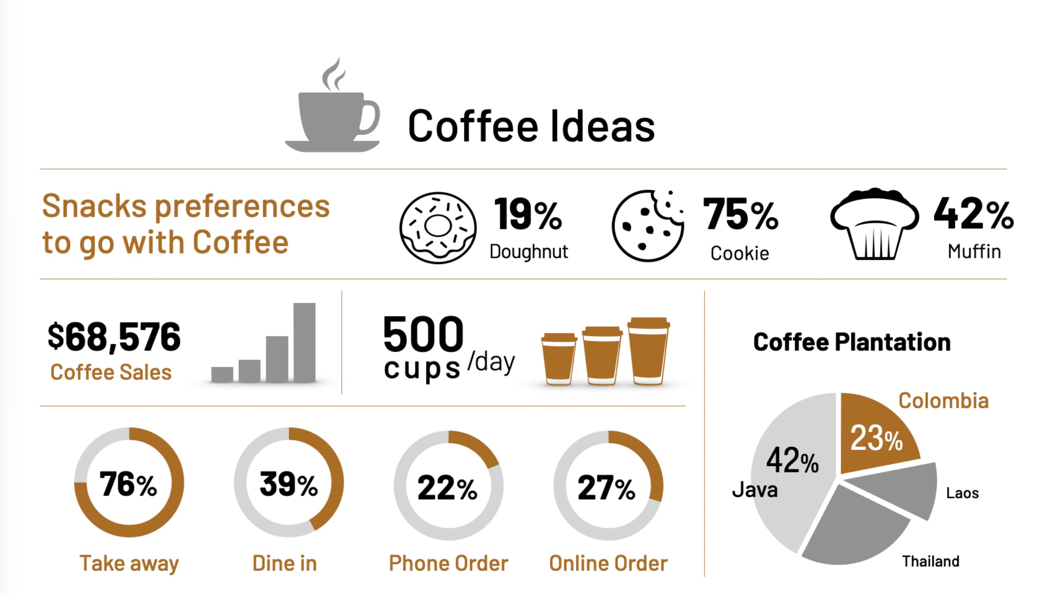
The video also shows a more detailed example described as an infographic data dashboard. The coffee example combines headline figures, food preferences, sales information, order methods and regional data within one coordinated layout.
A dashboard contains more information than the earlier lunch-preference slide, but it still requires hierarchy. The audience needs to know where to look first, which figures belong together and which comparisons matter. Sections, alignment, spacing, repeated colours and consistent icons make the larger set of information manageable.
Complex elements are possible, but they are not the starting point
With more advanced techniques, PowerPoint and Keynote can also create detailed elements such as a plane, a ship or a figure performing a jumping jack. These examples show what the software can do, but complexity should not become the objective.
Begin with simple elements that improve the communication. A circle, rounded rectangle, line or familiar symbol may already be enough. Add detail only when it contributes to what the audience needs to understand.
Try creating one element yourself
If you are new to infographics, start with one small experiment. Choose an idea from an existing presentation and ask whether a simple combination of shapes could represent it more clearly than a sentence or bullet point.
You might create a person, product, process step, clock, comparison symbol or simple data marker. Group the shapes, make copies and test different arrangements. Keep checking that the result remains visible, focused and easy to understand.
The purpose of an infographic element is not merely to make a slide look better. It is to make the information more alive and the message easier for the audience to see. PowerPoint and Keynote give you enough to begin; the most important tools are still a clear communication objective and sound visual judgement.
If you find the demonstration useful, you can subscribe to the Sticky SPY YouTube channel for more ideas on presentations and slide design.


