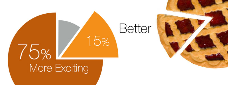
Pie charts are usually created by selecting some data, clicking the chart button and accepting whatever the software gives us. That’s convenient, but it also means the charting software makes many of the visual decisions for us. Every segment follows the same basic structure, labels are treated similarly, and the chart tends to present all the data as equally deserving of attention.
But what if one part of the pie is the real reason you’re showing the chart?
Instead of treating the pie chart as a fixed object, try thinking of each segment as an individual visual element. When you construct the chart yourself, you can control its position, colour, labels and emphasis — and design the chart around the message you want the audience to see.
1. Decide what the chart is saying
The data doesn’t tell you how the chart should look. First decide what you want the audience to notice.
In the examples below, 75% choose cookies, 15% choose bread and 10% choose other things to eat with their afternoon coffee. If the important finding is that 75% choose cookies, then 75% should probably dominate the visual hierarchy. If the surprising finding is the 15% choosing bread, you might instead draw attention to that segment.
The same data can support different messages. Your design decisions should follow the message.
2. Treat the segments individually
Compare these two manually constructed examples. The first keeps the pieces close together. The second pulls the 15% Bread segment away and gives it more independence.
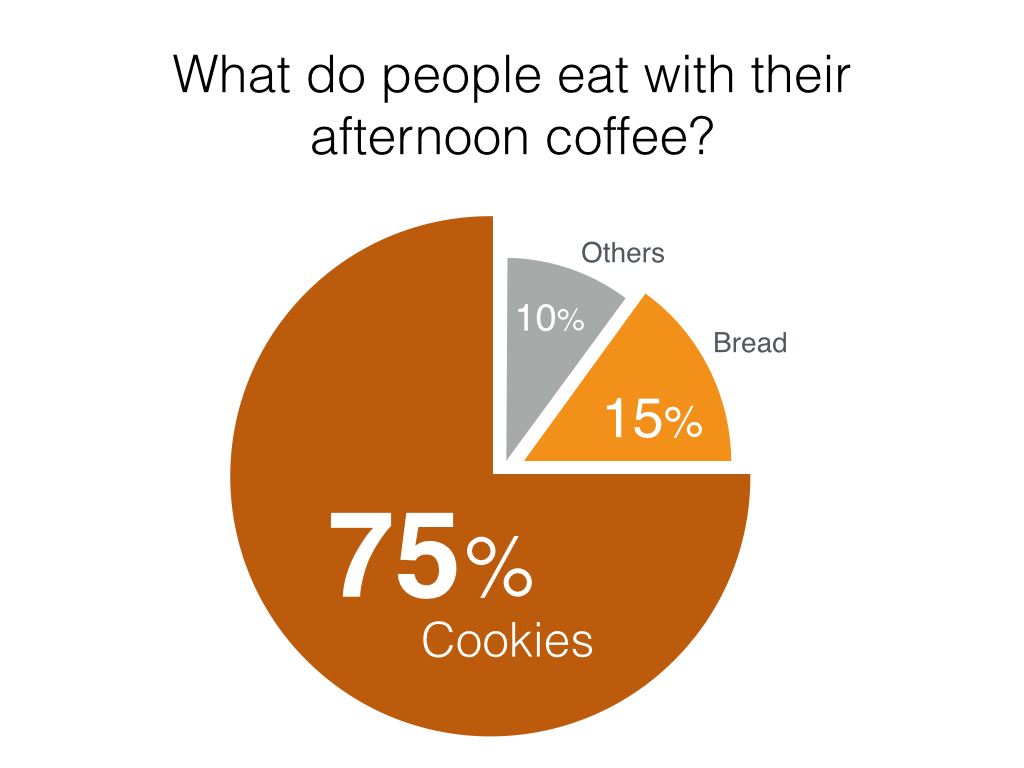
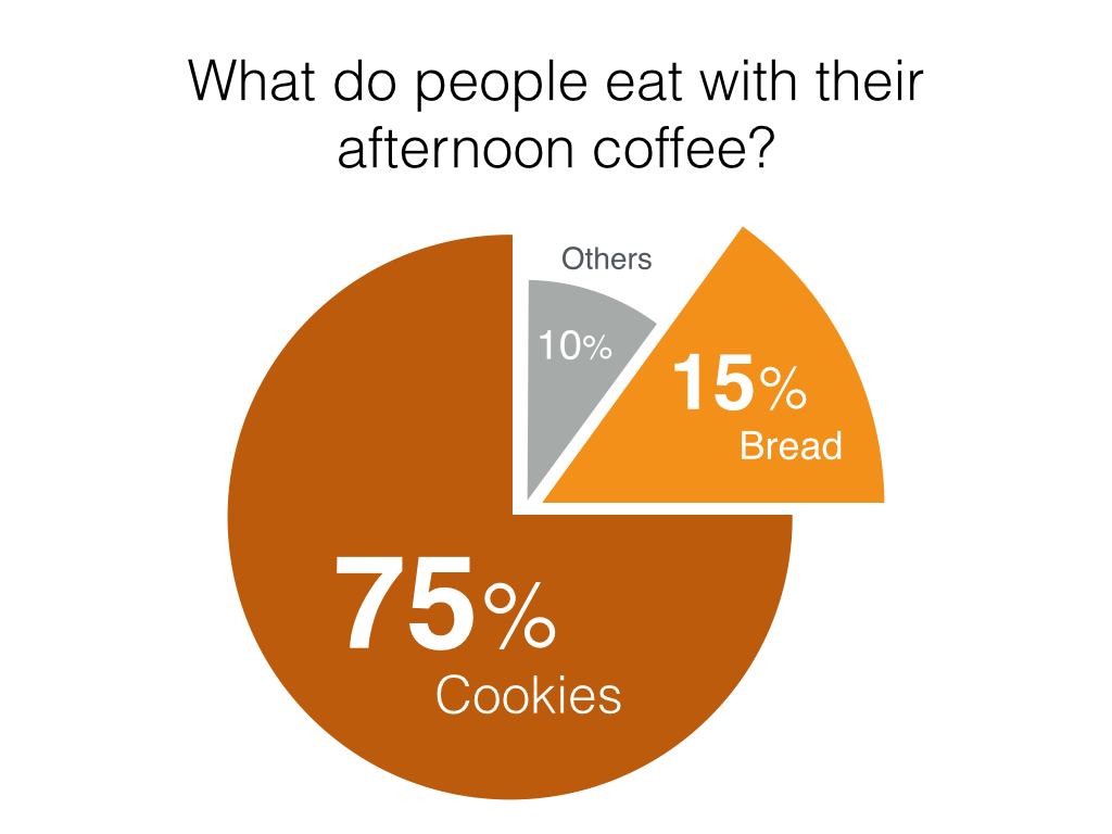
Separating a segment isn’t simply a decorative effect. It changes the relationship between the pieces. In the first example, the three segments are read primarily as one complete pie. In the second, pulling the 15% segment away makes it easier to notice.
That can be useful when you want to discuss one category specifically while still showing its relationship to the whole. Don’t explode every segment just because you can. If everything is emphasised, nothing is emphasised.
3. Make the numbers part of the visual hierarchy
Notice that the percentages don’t all need identical typography. In these examples, 75% is the largest number, 15% is smaller and 10% is smaller again.
If 75% is the important finding, its number can become one of the largest elements on the slide. The category label can be secondary. A supporting segment can use a smaller treatment, provided its label remains easy to read.
You’re not changing the data. You’re changing the visual hierarchy so that the audience knows where to look first. The size of the type communicates emphasis; the geometry of the pie must still communicate the quantities accurately.
4. Use colour with a purpose
Colour can help establish hierarchy too. The examples use dark orange, bright orange and grey. The bright orange helps the Bread segment stand out, while the neutral grey allows Others to recede.
But colour should have a job. Using several bright colours simply because the software offers them can make every category compete for attention.
Ask yourself: Which part should the audience notice first? Which parts only need to remain visible for context? Keep enough contrast between the labels and their backgrounds, and use words and numbers as well as colour to identify each category.
5. Put labels where they are easiest to understand
Default charts often place labels according to predefined rules. Once you’re constructing the chart manually, you can position each label where it works best.
A large segment may comfortably contain both its percentage and category name. A smaller segment may need a different arrangement. Notice how Bread sits outside its segment in Fig. 1 and inside it in Fig. 2, while Others stays outside the small grey segment.
What matters is that the audience can immediately connect the label with the correct segment. Avoid making people repeatedly look from a colour to a legend and back to the chart if the information can be labelled directly. If an outside label could refer to more than one segment, reposition it or add a simple guide line.
6. Keep the proportions honest
Greater design freedom doesn’t mean changing the meaning of the data. If a segment represents 15%, its angle should still represent 15% of the whole. Moving it, colouring it or changing its label is a design choice; enlarging it until it visually represents more than 15% would distort the data.
For this example, 75% of a full 360° circle is 270°, 15% is 54° and 10% is 36°. Keep the same radius for all three segments so their areas remain proportional to the values. If you separate a piece, move it without scaling it.
The original illustrations above use different segment radii, so their visible areas are not strictly proportional to the labelled values. Learn from their typography, colour and label placement, but use equal radii when building an accurate pie chart of your own.
Use manual construction to control emphasis, not to alter proportion. Check the finished shapes against a chart generated from the same data, and repeat that check whenever the values change.
Now build the pie yourself
The purpose of this exercise isn’t simply to reproduce the example. It is to experience what happens when you stop treating the pie chart as one object.
Using PowerPoint, Keynote or your preferred presentation software, create each segment using shapes rather than the charting tool. You don’t need external software or imported images.
Challenge tips
There are two activities to start with:
- Look for a shape in the shape tools that will allow you to create individual segments of the pie. Set their angles to match the percentages, keeping the same radius for every segment.
- Align the segments around a common centre to form the complete pie, then set the colour and label treatment for each segment.
Once the pieces are independent, experiment with them:
- Separate one segment without changing its size.
- Change the visual emphasis of one category.
- Resize and reposition the labels.
- Make the most important number dominant.
- Use colour to establish hierarchy.
- Put the pieces back together and compare the result with the software-generated chart.
Try creating two versions from exactly the same data, each emphasising a different finding. That’s where the real lesson begins: the data stays the same, but the visual story changes.
The shape controls differ between presentation tools. If you have difficulty solving this challenge, drop me an email and tell me which software you’re using so that I can send you the appropriate instructions.
Don’t let the charting software make every decision
Charting software is useful when you need to create a chart quickly. But its default output is only a starting point.
When the chart is simple enough, manually constructing it can give you much greater control over what the audience sees first, what remains as supporting information and how you reveal the story in the data.
Start with the message. Decide what deserves attention. Then use position, colour, typography and separation to create that hierarchy.
The objective isn’t to make a pie chart more decorative. It’s to make the message in the pie easier to see.


