A survey can generate a lot of data.
There may be dozens of questions, hundreds of responses and many different ways of analysing the results. But when it is time to present those findings, the audience rarely needs to see everything that was collected.
The first design decision is therefore not:
Which chart should I use?
It is:
Which findings does my audience actually need to see?
Once that is clear, the survey data can be simplified and turned into visuals that make those findings easier to understand.
Start with what matters
Before designing the slides, look at the purpose of the presentation.
Perhaps you are presenting an employee survey and want to explain why staff are not using the company canteen. The questionnaire may contain many questions, but only a few responses may be directly relevant to that discussion.
Select those findings first.
This is different from preparing a complete survey report. A report may need to document the results comprehensively. A presentation needs to help an audience understand the findings that matter to the discussion.
That doesn’t mean hiding inconvenient results. It means selecting and organising information according to the purpose of the presentation without changing what the data says.
Turn questionnaire wording into presentation language
Survey questions and their response options are often written carefully because they are designed to collect data.
That wording does not always need to be reproduced in full on a presentation slide.
A questionnaire might ask:
What are the reasons you do not usually eat at the company canteen?
Respondents might be given several options such as:
- The variety of food choices available is too limited.
- The prices at the company canteen are too expensive.
- The waiting time during lunch is too long.
- I prefer eating at restaurants outside the company.
On the presentation slide, these could become:
- Limited food choices
- Food is too expensive
- Long waiting time
- Prefer eating outside
The audience can concentrate on comparing the findings rather than reading the original questionnaire wording.
The important point is to simplify the language without changing what the response represents.
Questionnaire response → Presentation label
The waiting time during lunch is too long.
→ Long waiting time
The variety of food choices available is too limited.
→ Limited food choices
Let the bars do the comparing
Once the important responses have been selected and their labels simplified, a basic bar can communicate the results very effectively.

The length of each bar represents the percentage of respondents who selected that particular response.
The audience can therefore compare the reasons visually before reading the exact percentages. They can immediately see which reason was selected most frequently and how the other responses compare with it.
In other words:
The bar gives the comparison. The number gives the precision.
This is particularly useful when several questionnaire responses need to be compared on the same slide.
There is usually no need to add unnecessary chart elements simply because charting software provides them. If axes, gridlines, legends or other elements do not help the audience understand the result, they may not be needed.
The objective is to make the differences between the responses easy to see.
Make the percentage meaningful
A percentage on its own doesn’t necessarily tell the audience what it represents.
In this type of questionnaire, 72% might mean that 72% of respondents selected Long waiting time as one of their reasons for not eating at the company canteen.
If respondents were allowed to select more than one reason, the percentages across all the responses do not necessarily add up to 100%.
The slide should therefore make it clear what the percentages represent. The audience should not have to work this out for themselves.
This is also one reason not to automatically treat these responses as parts of a whole. The objective is to compare how frequently each response was selected.
The same visual language can show progress
Bars are useful for questionnaire results because people can compare their lengths easily.
The same visual principle can also be used when the percentage represents something different.

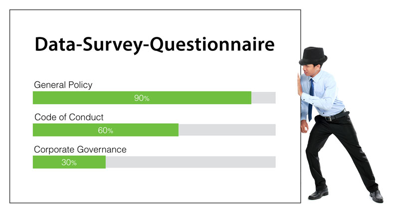
Here, instead of showing the proportion of survey respondents, the length of the bar represents the degree of completion of an activity.
The visual form is similar, but the meaning has changed:
- Survey result (Fig. 1): bar length represents the percentage of respondents who selected that response.
- Progress status (Fig. 2): bar length represents how much of an activity has been completed.
Figures 1 and 2 show how the same visual form can encode different information. The audience must therefore understand what the bar length represents.
Don’t begin with the chart
When presenting questionnaire findings, it is tempting to open the charting software and start experimenting with pie charts, bars and other visual formats.
Start one step earlier.
Ask:
What did we learn from the survey that this audience needs to understand?
Select the findings that answer that question. Simplify lengthy questionnaire wording where appropriate without changing its meaning. Then choose a visual form that makes the differences or relationships easy to see.
For many questionnaire results, a simple bar and percentage may be all that is needed.
The objective is not to present every piece of data collected by the survey.
It is to help the audience see and understand the findings that matter.


