Line charts are a familiar way to present time-based data, and they are often exactly the right choice. They allow an audience to see how values changed from one period to the next and to recognise the shape of a trend.
Start with the message, not the chart
Before choosing the visual, ask: What do I actually want the audience to understand? Fig. 1a and Fig. 1b use the same underlying population data and communicate the same message: Population more than doubled since 2005. The line chart shows the journey across every year from 2005 to 2020, including the shape and pace of the change.


Fig. 1b removes the intermediate years and makes the scale of growth the visual story. Neither treatment is inherently better. If the audience needs to understand how the population changed across multiple periods, the line chart is appropriate. If the main message is how significantly the population grew, a technique I call Growing Numbers can communicate that point more directly. The visual form should follow the communication objective.
Growing Numbers has another benefit. By turning the numbers themselves into strong visual elements, it gives the slide greater visual impact and can make the presentation more engaging. Instead of adding decoration to the data, the data itself becomes part of the visual design.
Select the numbers that tell the trend
Growing Numbers works best with a small selection of meaningful values. Start with the earlier value, add one or two significant intermediate values and finish with the latest or result value. In Fig. 1b, 3.5 million, 4.7 million and 8.1 million allow the audience to understand the progression without displaying every year.
The selected numbers must fairly represent the underlying data. Do not select only the points that make the trend appear stronger than it really is. If meaningful declines, reversals or fluctuations occurred between the selected points, hiding them could create a misleading impression of continuous growth. Simplifying data is useful. Changing the story told by the data is not.
Let position and size reinforce the direction
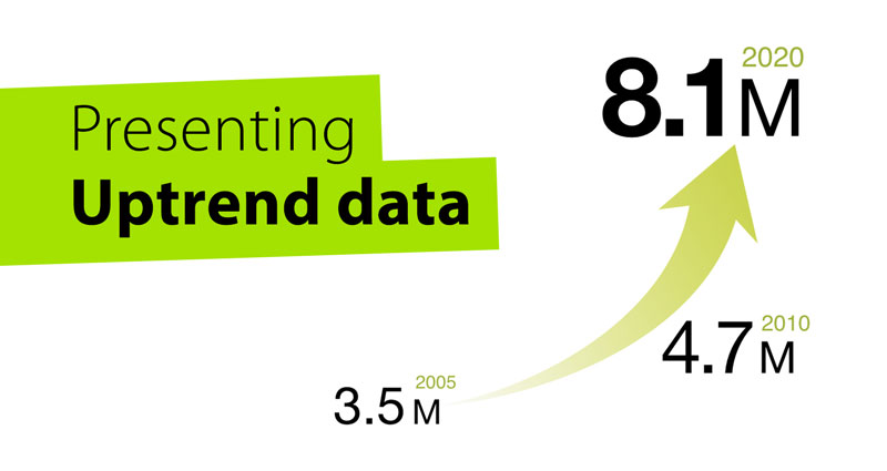
Compare the plain treatment in Fig. 1b with the developed composition in Fig. 2. The values still increase from 3.5 million to 8.1 million, but now the numbers also become larger and rise from the lower left towards the upper right. The arrow reinforces that direction. Value, size, position and direction work together, so the composition itself creates a stronger sense of upward movement.

Supporting labels such as the year, quarter or category should remain easy to associate with their values without competing visually with the numbers. The important values should attract attention first; the labels provide the context needed to interpret them.
Size is emphasis, not another data scale
Increasing the font size of later values is a visual-emphasis technique. It does not need to be mathematically proportional to the underlying data. If a value doubles, for example, the later number does not need to occupy exactly twice the visual area. The printed values communicate the magnitude; size reinforces the sense of progression.
Growing Numbers is therefore not a substitute for a precisely scaled statistical chart when the audience needs to compare magnitude accurately. Use it when emphasis and direction are more important than reading every change from a scale.
Add an arrow only when it helps
The arrow in Fig. 2 guides the audience from the first value towards the result and strengthens the composition, but it is optional. Fig. 1b already communicates growth through the increasing values and their sizes. If those signals make the movement clear, an arrow may not be necessary.
You can find an appropriate arrow image or draw one yourself. This short PowerPoint demonstration shows how to draw the upward arrow used in the example. Add a visual element because it helps communicate the message, not simply because there is room for it.
Images should add meaning, not decoration
Fig. 3 develops the same concept by adding a family photograph. The image gives the population figures a human context and helps explain what is growing; it is not merely decorating the slide. A useful supporting image should strengthen the meaning in this way.

Customer growth might use an appropriate customer or user image, the number of stores might use a store or location image, and production capacity might use a relevant product or production image. Not every Growing Numbers slide needs one. The image should help explain what is growing, not merely decorate the slide.
When Growing Numbers works — and when it doesn’t
Use Growing Numbers when one measure is clearly increasing, only a few key values are necessary, and the main message is the scale or direction of growth. It works when the audience does not need a precise comparison of every period.
Use a line chart when the audience needs to see what happened across multiple periods, when fluctuations or the rate of change matter, or when several trends need to be compared. Use a bar or column chart when the main task is comparing individual values or categories rather than showing a continuous trend. Growing Numbers is not a more interesting replacement for these charts; the visual form should follow the communication objective.
A final practical check
What is my message? Is the important story genuinely about significant upward movement?
Have I selected the data fairly? Do the chosen values accurately represent what happened?
Does every visual element reinforce the message? Do size, position, the arrow and any supporting image help communicate growth, or are some merely decoration?
A line chart allows the audience to see the trend. Growing Numbers can make the growth itself the visual story.


