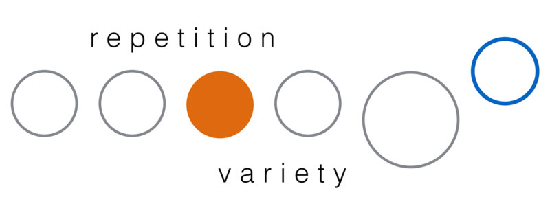
Repetition in design is used to ensure some degree of consistency in the overall look and feel of visual elements. This can be in the use of colours, shapes, fonts, positioning, etc. This technique can also be applied when designing for presentation slides. For example, having consistent colours and fonts makes it easier for the eyes when viewing information from one slide to another. Having text at same location on each slide makes it easier to follow.
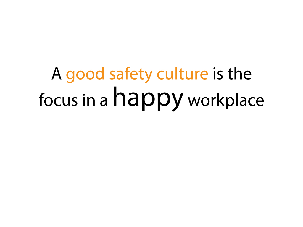
However repetition without variety can be boring and monotonous. Adding slight variety to fonts, shapes, colours, and position can make the overall slide design much more interesting. Too much variety on the other hand can be confusing and thus makes the slide complicated and difficult to understand.
Below are a few examples on how this can be applied to your presentation slides.